
An Online Exhibition Story
Asia at the World’s Fairs
Scroll ↓
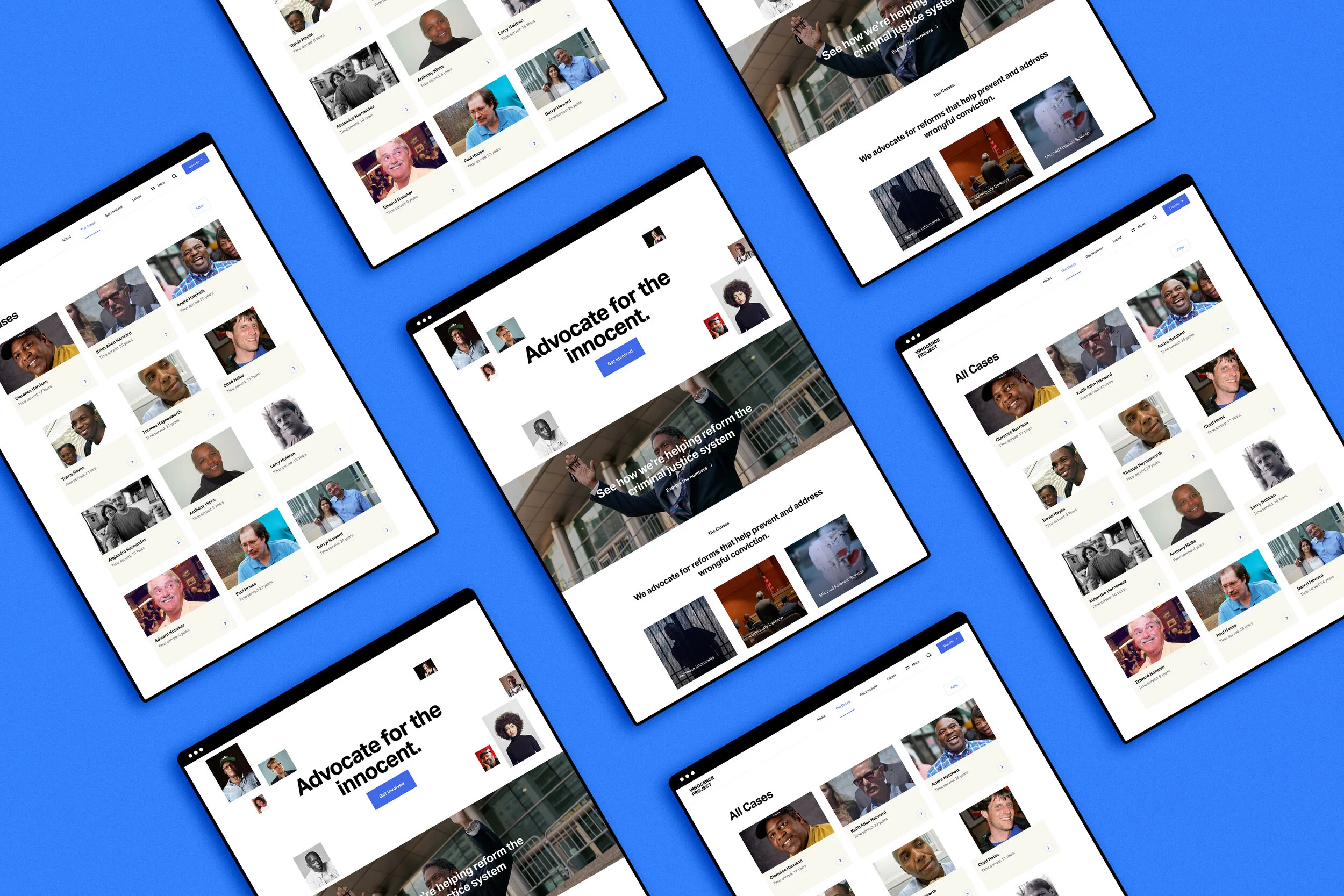
ABOUT OUR PROJECT
Asia at the World’s Fairs is an online exhibition exploring the contributions Asian cultures have made on the formation of world culture at international fairs, beginning with the 1851 Crystal Palace exhibition in London through the fairs of the 1930s.
I was hired by Boston University Center for the Study of Asia (BUCSA) to build and design an online exhibition via Wix platform. Two concrete themes were launched and presented at a Boston University symposium in April 2018, discussing how online exhibitions can serve as an engaging, interactive vehicle for the study of cultural exchange and archival materials in today’s digital age.
CLIENT
Boston University Center for the Study of Asia
TIMELINE
Sep 2016 - Aug 2019
DESIGN TOOLS
Adobe (Photoshop, XD)
Wix
MY ROLE
I worked collaboratively with Boston University professors and supervised three undergraduates to launch an online exhibition featuring two themes on “Architecture” and “Dance” for the initial website launch.
My roles included:
Independently designing and building a twelve-page, curated media-rich online exhibition
Managing Asia at the World’s Fairs website mock-ups and journey maps
Collecting and presenting 700+ archival materials from Western, Chinese, and Japanese online databases
JOB TITLE
Web Designer
Co-curator
PROJECT PATH
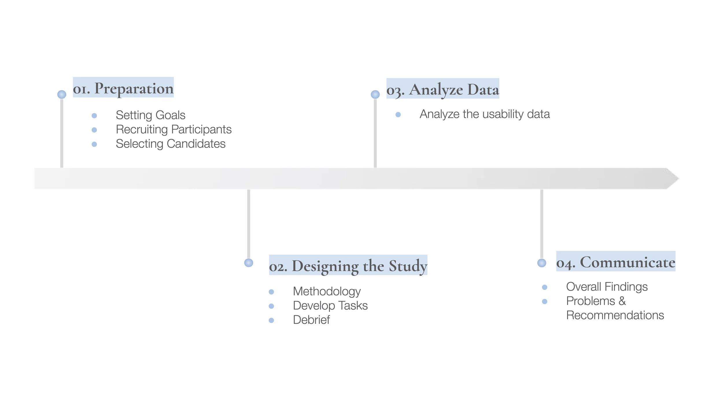
01.
Preparation
SETTING GOALS
In the kickoff meeting, BUCSA revealed they are interested in getting users to learn more about what the Innocence Project does and what they can do to support and spread awareness for the organization.
With the client’s challenge in mind, we framed our design aim as:
This exhibition intends to create a platform for an open discussion of the contributions Asian cultures have made on the world stage through these fairs and the enormous impact they had on millions of Western fairgoers for whom the “world” as a concept became real for the first time.
structured along “themes,” with each theme illustrated by one or more “exhibitions”
“To create a visually driven interactive website to have user feel like they are visiting a world’s fairs, but in today’s digital age.”
RECRUITING PARTICIPANTS
Characterize Our Users
One user profile was chosen pertaining to the Innocence Project’s request:
1. Potential Advocates
And our selection criteria were defined as:
Individuals who are interested in social justice or criminal reform issues
Individuals who have specified employment status and job roles more closely related to law, non-profit, and social justice issues
Individuals who are advocates within their communities
Individuals within the age range of 25-55 that is more closely related to the typical user group of Innocence Project’s website
Finding Participants and Writing the Screening Questionnaire
A screening questionnaire was then sent out via UserTesting.com, a human insight platform with a diverse database of participants aimed to deliver rapid and valuable feedback for organizations.
SELECTING CANDIDATES
A total of 6 pilot tests (three desktop, three mobile) were launched. Iterations were made after obtaining feedback from our pilot tests to make our tasks more understandable to participants. After the revisions, 6 more usability tests (three desktop, three mobile) were conducted. Here is a breakdown of our twelve selected participants:
Who are our participants?
Age
Gender
02.
Designing the Study
METHODOLOGY
Our team utilized the Unmoderated Remote User Testing method, which is an effective method of evaluating the usability of an interface by having users’ complete tasks in their own environment without a facilitator present. The benefit of running a URUT is the test is administered via an online platform so recruiting participants is an easier process and results can be obtained quickly compared to face-to-face user testing.
Each user was asked to record their experience interacting with the interface via video recordings as they “think-aloud” while performing the tasks.
Here is a summary of our user tests:
We used UserTesting.com to conduct 12 user tests, 30 min sessions each
Participants were asked to complete 2-3 tasks (either mobile or desktop)
Audio, video and screen sharing recordings were captured
Qualitative insights were collected from the think-aloud method, follow up task questions, and post-test questionnaire/questions
DEVELOP TASKS
The following tasks were assigned:
1.
Target: Potential Advocates, Desktop
“You are a public defender doing legal research on homicide-related cases with convictions in the state of Mississippi. You need to find cases where the exoneration took place in 2001 and 2019 in Mississippi, where improper forensic science led to the victim’s conviction. After doing a quick search, you found a few cases. Please share the first case with a colleague.”
2.
Target: Potential Advocates, Desktop
“You recently learned about the Rosa Jimenez’s murder case and you want to find out how you can help Rosa in some way. What’s the best way to quickly search for this information?”
3.
4.
5.
Target: Potential Advocates, Mobile
”You read a news article called “Outpouring of Support for Ava DuVernay’s Powerful Series “When They See Us” that was posted in June 2019. Find the news article again to share with your friends.”
Target: Potential Advocates, Mobile
”You are a student planning to host a fundraising event to raise awareness for wrongful convictions. Find the steps to host an event on the Innocence Project.”
Target: Potential Advocates, Mobile
“Your friend was wrongfully accused and you believe that DNA can help exonerate him. You want to find cases where the Innocence Project helped a homicide related case where the accused was exonerated with DNA evidence. After doing a search, please review the first two cases on the search results page and learn how the Innocence Project helped the clients.”
DEBRIEF
After each session, we analyzed our data individually then came together as a team to talk about the general insights learned from all of our sessions.
03.
Analyze Data
ANALYZE THE USABILITY DATA
All twelve video recordings and feedback questions were reviewed by each usability expert on our team. A full list of usability problems, suggestions for improvements, positive reactions as well as frustrations with the interface can be found below.
04.
Communicate
OVERALL FINDINGS
Overall, most participants were impressed by the modern and minimalistic design that forges trust with the visitors. However, they also found some design elements are not obvious enough to stress the importance of identifying important information.
Our team focused on three dominant problems and four recommendations on the “Case” page, “Get Involved” page, and the navigation bar to enhance the experience of achieving user goals on the Innocence Project website.
PROBLEMS & RECOMMENDATIONS
Case Page, Desktop and Mobile
Problem #1: Some case filters are confusing and misleading. Users struggle to find key information efficiently on both the desktop and mobile interface.
Recommendation: Clarify case filter labels and replace checkbox lists with radio buttons on the desktop. Add shortcut filters and display applied filters on mobile.
Most users were frustrated with the filters under “All Cases.”
“The filters are janky and need to be streamlined so information can be sorted in a way that’s easily understandable.”
Original “Case” page on desktop
Problem (Desktop):
Three users failed to realize “State of Conviction” is a location filter because of the word choice and open-ended search bar.
Lack of label order and discrepancy in the information on the “Case” page and “Case Details” page makes it difficult for users to find information quickly as they will have to manually look through each case.
A checkbox list is used for all filters including mutually exclusive results. The checkbox works for filters such as “Year of Exoneration” where selecting more than one option will produce multiple cases as each option operates individually. However, using checkboxes for non-multiple select filters such as “Innocence Project Involved” and “Race of Defendant” will confuse users as selecting more than one option will produce zero cases.
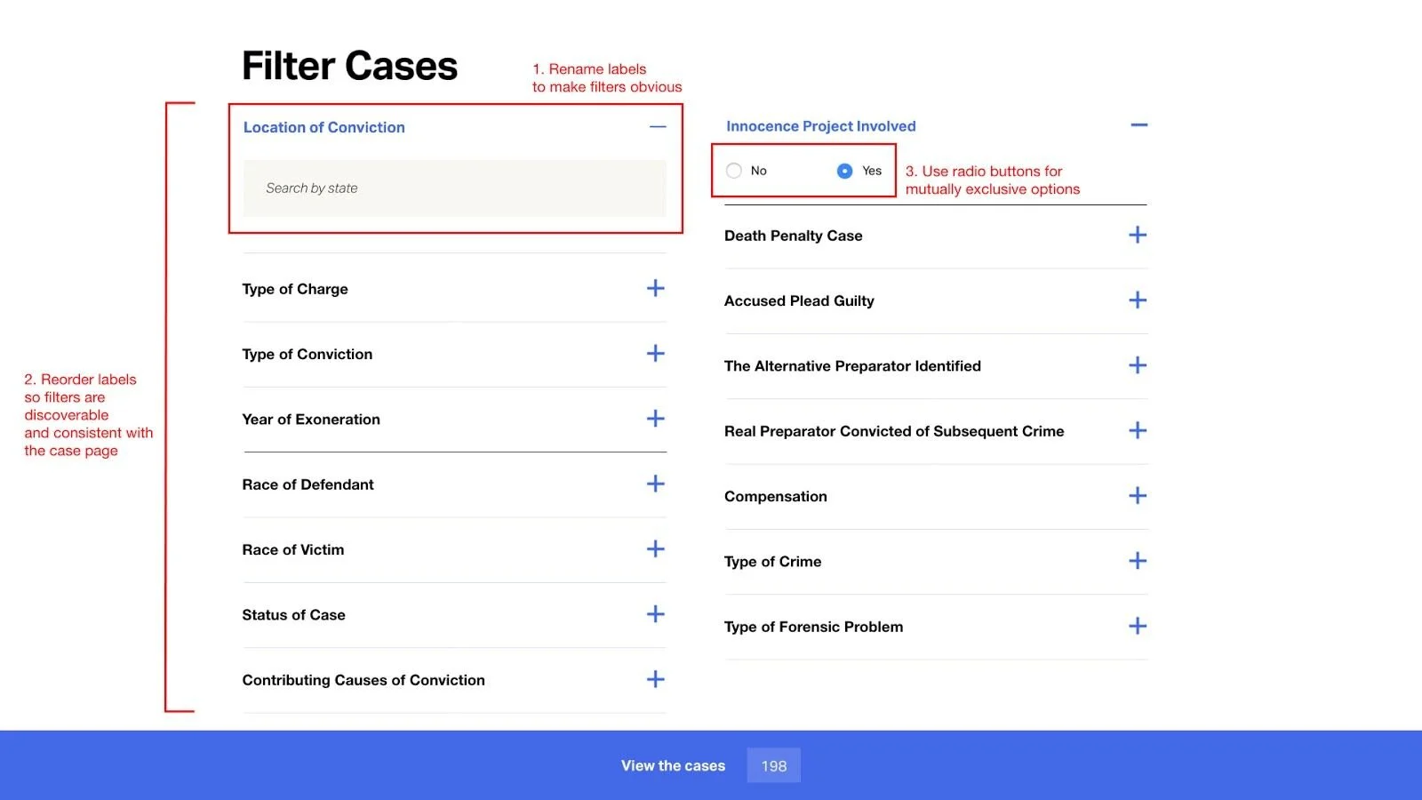
Revised “Case” page on desktop
Recommendation (Desktop):
Revise “State of Conviction” label name to “Location of Conviction” and include a helpful phrase in the search bar.
Organize the label order into three main groups (Figure 1). Include filters such as “Type of Charge” and “Type of Conviction” on the “Case” page so filters are discoverable and in a consistent order with the “Case Details” page.
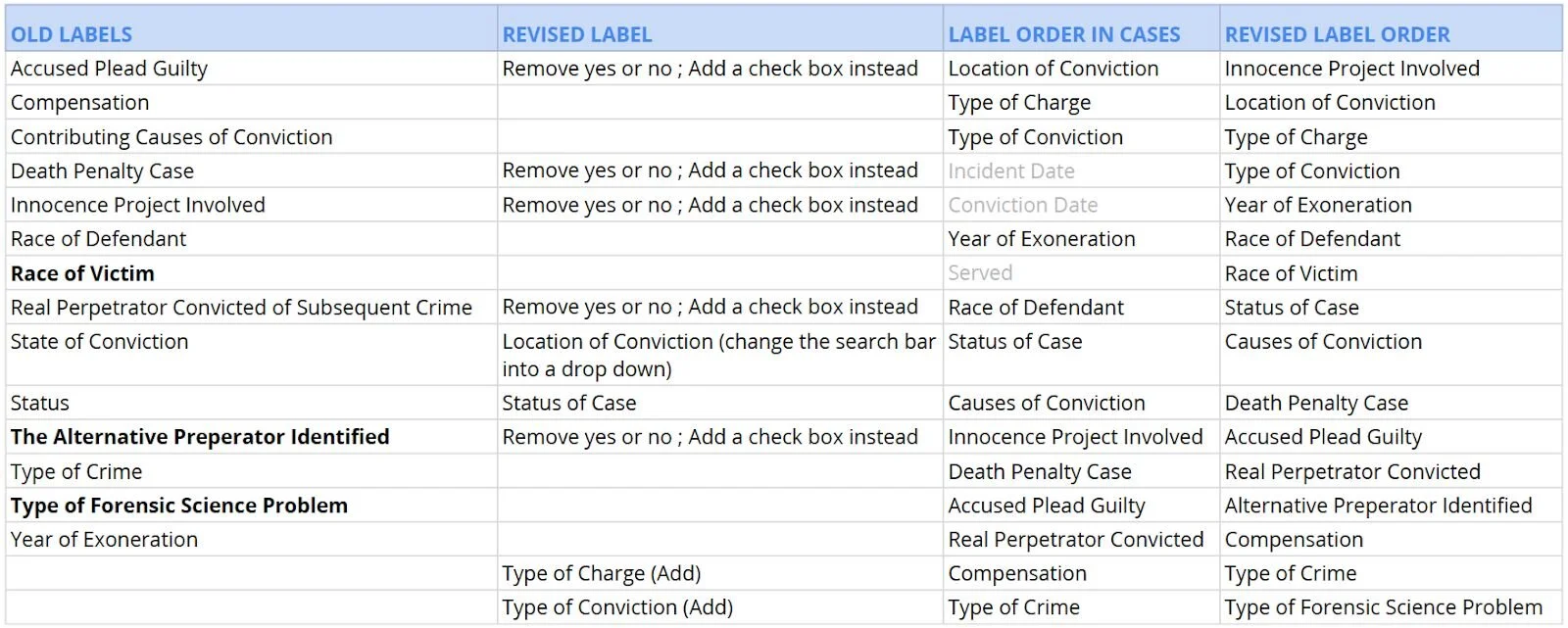
Figure 1
3. Switch checkbox lists to radio buttons on the desktop. This way, mutually exclusive options cannot be selected at the same time.
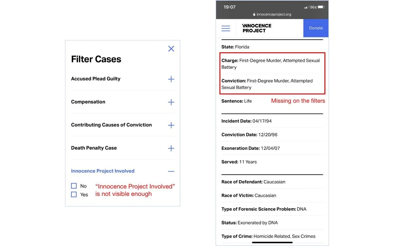
Original “Case” page on mobile devices
Problem
Information is not as visible and easy to find. “Innocence Project Involved” is hidden at the bottom of all filters which decreased the efficiency of looking up information and engagement of the
website.
Users found mobile case filters overwhelming and troublesome as they need to scroll through the list over and over again. They expected each “Case” page to separate case details into sections such as crime, trial, and appeals.
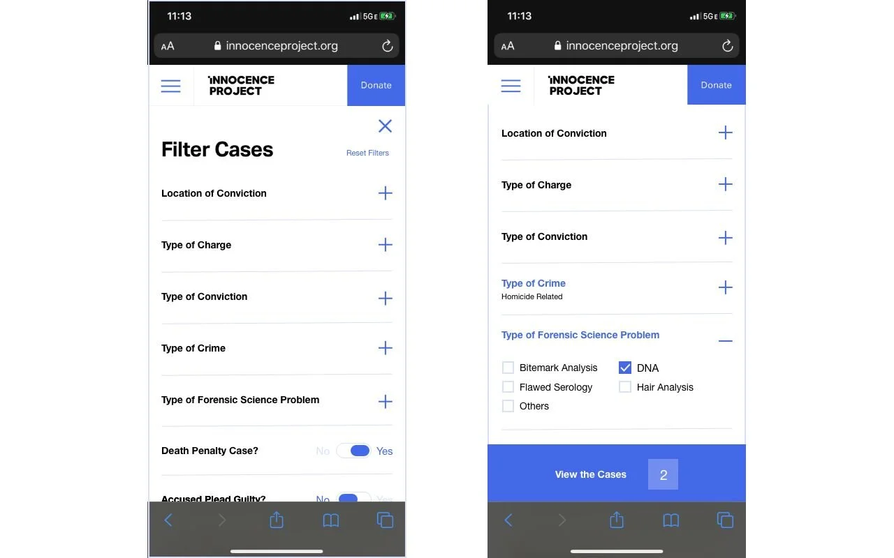
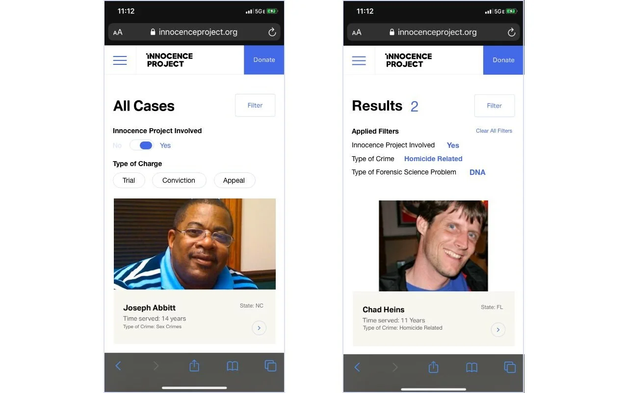
Revised “Case” page on mobile devices
Recommendation:
Add shortcut filters/toggle buttons for “Innocence project involved” and “Type of charge" to the cases search results page to provide. Design a quick access button to clear all filters.
Show applied filters on the search results page on mobile so that users can know what options are available to them and how many case results there are.
Get Involved Page, Desktop
Problem #2: “Campaign” section is not easily discoverable.
Recommendation: Move the “Campaign” section under the “Get Involved” page.
We observed that participants had trouble finding specific campaigns and sharing them as they were looking at a different section of the website. The main reason for this usability issue was that the Innocence Project site did not follow users’ mental models when creating its labeling and information architecture.
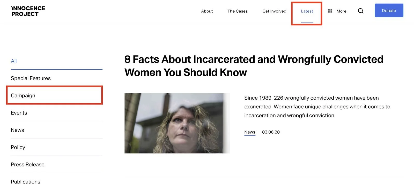
Problem:
Nesting “Campaign” under “Latest” does not match real-world conventions as participants had trouble understanding the connection between “Campaigns” and “Latest.”
Most participants understood the word “Latest” as latest organizational news and announcements, not related to campaigns.
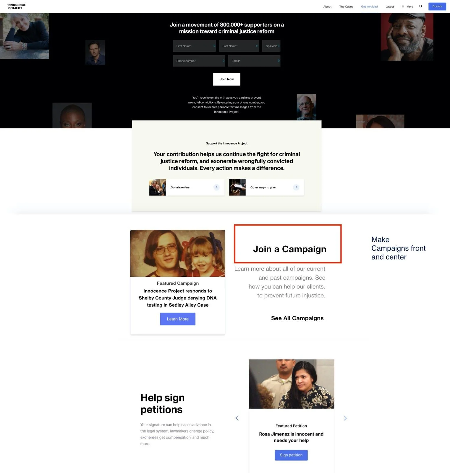
Recommendation:
Dedicate a tile specifically for campaigns under the “Get Involved” to make the campaign section of the site more discoverable.
Navigation Bar, Mobile
Problem #3: The search bar and “Ways to get Involved” are hidden.
Recommendation: Add sub-filters to the mobile navigation menu and make the search bar more discoverable.
The mobile navigation menu allows users to quickly browse the contents of the site and access main features such as the organization’s about page and their legal cases archive. Despite these useful features, the organization of the menu caused an issue for evaluators during the remote user tests. Overall, evaluators shared the sentiment:
“The site does look
great… it’s not as functional or as easy to navigate as it should be.”
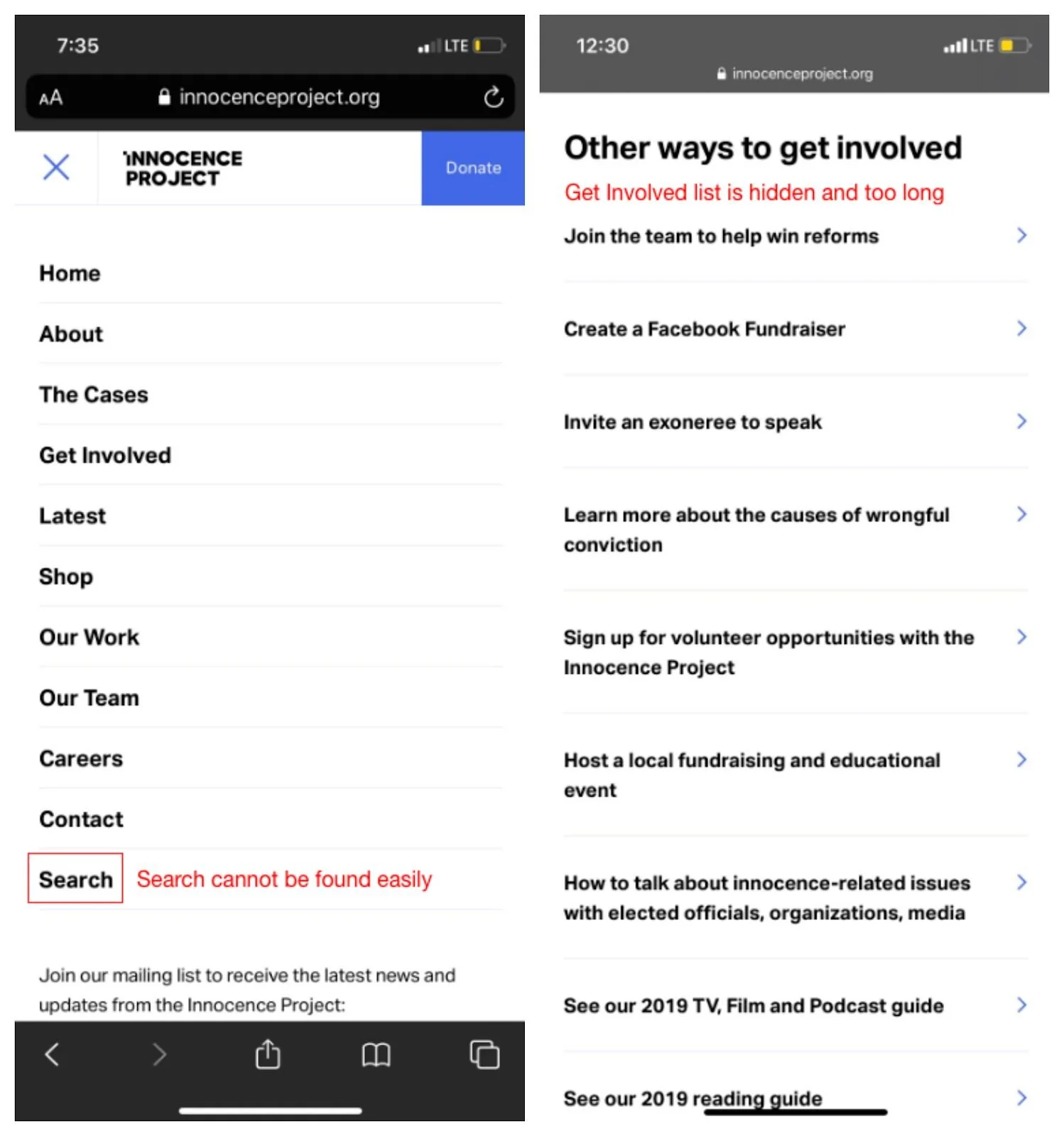
Original navigation bar on mobile devices
Problem
The current menu lacks subcategories. Users are likely to get overwhelmed with options as they have to scroll down on the page. They often completely overlooked the correct selection.
The placement of the search bar at the bottom of the navigation menu made it difficult for users to locate.
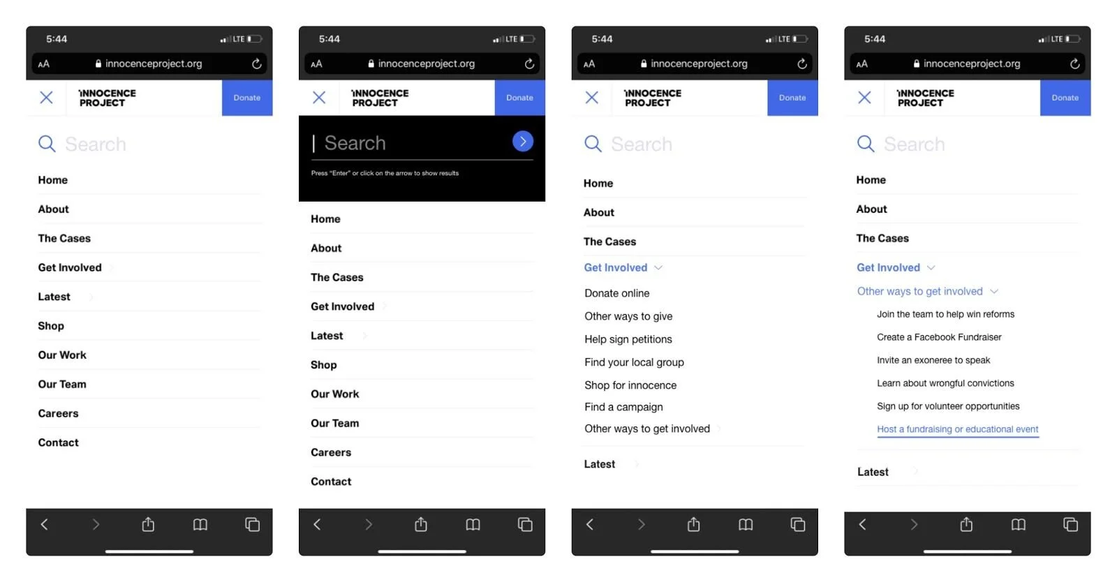
Revised navigation bar on mobile devices
Recommendation
Move the search bar to the top of the navigation menu to make the search feature more discoverable and potentially shorten their search time.
Design a search bar that provides instant feedback and instructions.
Add sub-filters to the main navigation menu such as listing options available for users who interested in being potential advocates under “Get Involved” page.
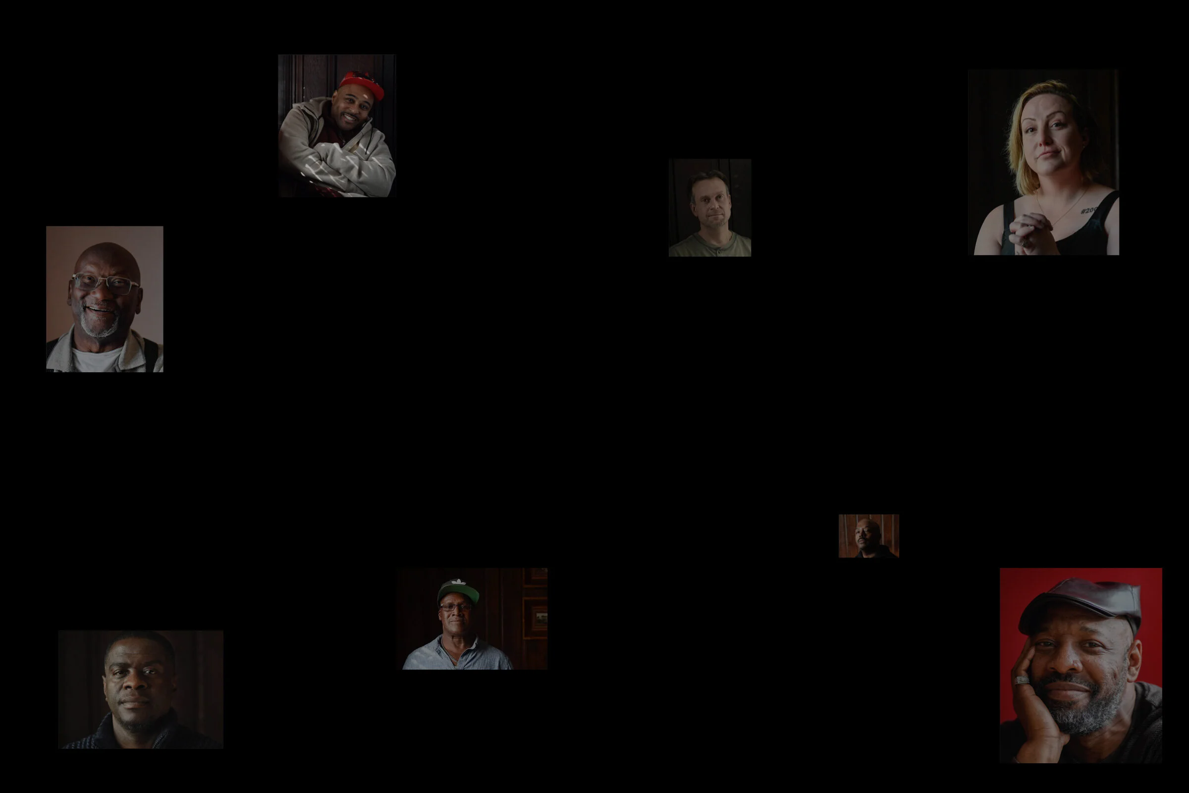
Photo credit: Innocence Project
REFLECTION
On March 11, 2020 our team submitted our written report with recommendations to the Innocence Project.
Conducting unmoderated remote user tests taught me the importance of refining our selection criteria and running pilot tests. Next time, I would dedicate more time in the preparation phase to make sure our screening questionnaire and demographics clearly match the client’s target group of interest.
Helped author an ongoing grant proposal to expand the number of online themes and applied lessons learned in an educational setting for courses pertaining to transcultural studies at BU
DELIVERABLES: