
A Website Evaluation Story
Canadian Museum of Nature
Scroll ↓
ABOUT OUR PROJECT
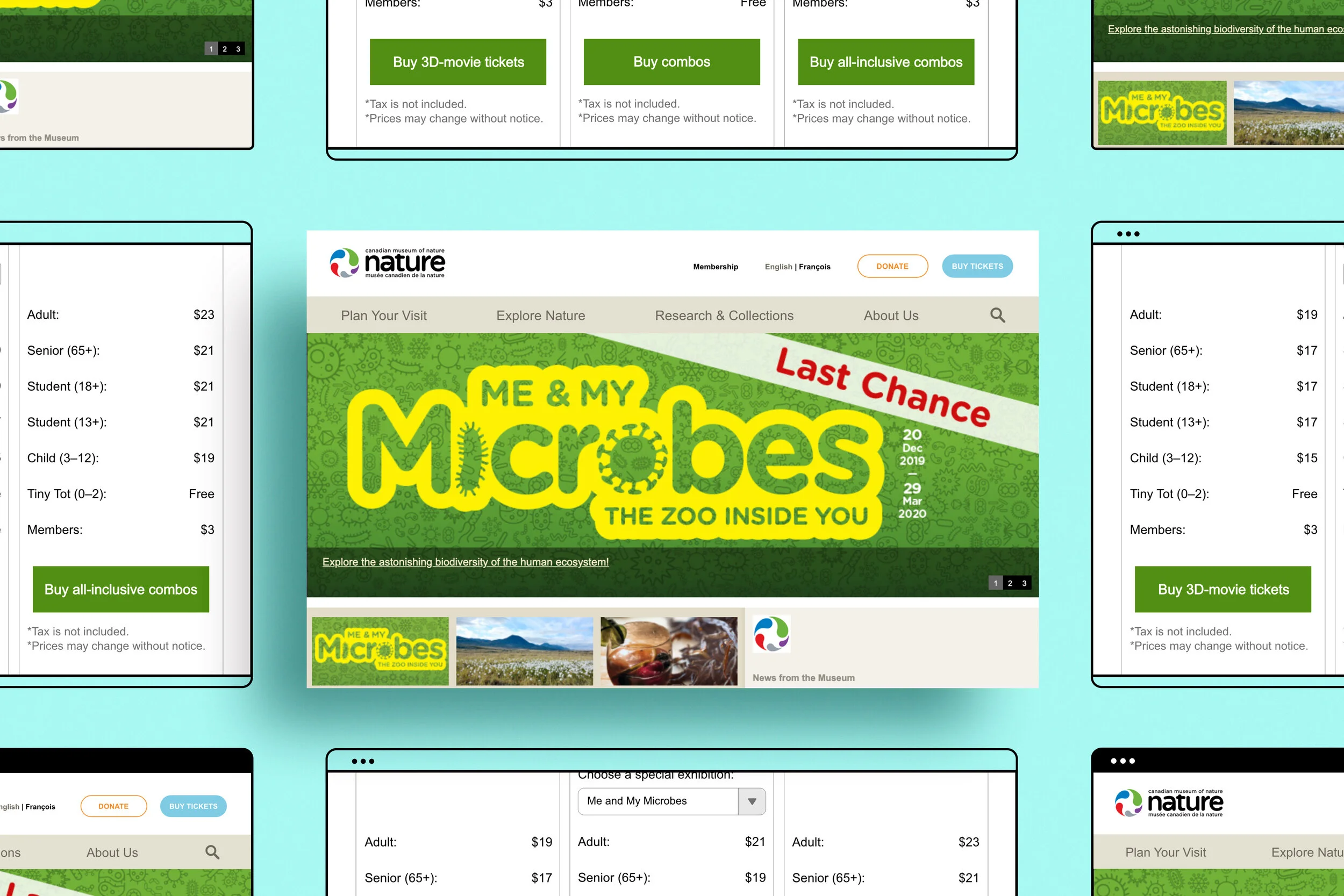
The Canadian Museum of Nature (CMN) is Canada’s national natural history museum located in Ontario, Ottawa. With just under 500,000 visitors a year, their website serves as a starting point for visitors to learn about their research programs, extensive collections, and exhibitions before their visit to the museum.
Their website initially launched in 2009 with minor updates throughout the years. Our team of four UX consultants from the Center for Digital Experiences at Pratt Institute partnered with CMN to conduct nine Moderated Remote User Tests. This method allows us to uncover the usability problems found on their current website in order to provide feasible recommendations for their redesign project in September 2020.
CLIENT
TIMELINE
6 weeks (Mar 2020 - May 2020)
DESIGN TOOLS
Adobe (Photoshop, InDesign, Xd)
MY ROLE
Our team worked collaboratively to submit a written report with website mockup recommendations as our final product.
My roles included:
Writing the user test moderator script
Conducting and moderating two virtual user tests
Analyzing and consolidating usability problems
Creating mock-up recommendations and writing report
Creating and presenting final presentation deck
TEAM MEMBERS
Liza Burroughs
Alejandra Estigarribia
Angela Wang
PROJECT PATH
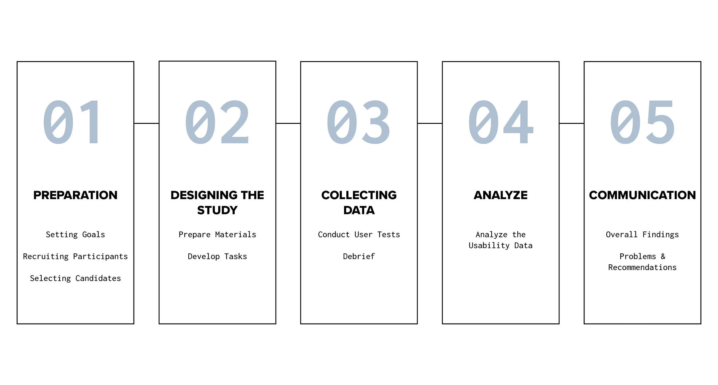
Photo credit: Trover
01.
Preparation
SETTING GOALS
In the kickoff meeting, CMN revealed the primary challenge of their website is that it has an “old look and feel” that does not mach the current time, nor is information presented in a way that provides optimal viewing experience for their most frequented pages.
With the client’s challenge in mind, our team framed our goal as: to provide visitors with a seamless user experience for the “Home Page” and “Plan Your Visit” sections of the website, and include an updated content and aesthetics design for our recommendations.
“How can we change what we currently have to match the current period from the user’s perspective?”
RECRUITING PARTICIPANTS
Characterize Our Users
Two user profiles were chosen pertaining to CMN’s request:
1. Parents
2. Tourists
And our selection criteria were defined as:
Has traveled for leisure within the past year
Has visited a local or foreign museum
Has used a museum's website
Is comfortable with using the internet
Finding Participants and Writing the Screening Questionnaire
A screening questionnaire was then sent out via four different avenues to help reach our target user groups:
Canadian Museum of Nature’s listerv
Pratt School of Information’s listserv
Center for Social Innovation’s listserv
Personal networks
SELECTING CANDIDATES
A total of 28 people responded to our screening questionnaire. Following our selection criteria, we filtered our responses to further narrow down candidates who we believed were the most representative of the target user groups of interest. Here is a breakdown of our nine selected participants:
Who are our participants?
Profile
Age
Gender
It should be noted that our original list of candidates included four parents. However, given the unusual circumstances we are in (COVID-19 season), three parents cancelled and were harder to recruit the second round. With our limited time frame, our team went ahead and contacted other candidates who fell under the user profile of tourists. Even though we didn’t recruit as many parents as we hoped, all of our selected participants remain representative of our user profiles and pass the criteria as visitors with museum experience.
02.
Designing the Study
PREPARE MATERIALS
We continued to prepare materials for our user tests.
These consisted of:
Consent form
to get consent for audio, video, and screen recordingsModerator script
to keep our results standardizedPre-test questionnaire
to get to know our participants betterPost-test questionnaire
to get to know how our participants feel
DEVELOP TASKS
Three tasks were developed, all targeting the frequently visited pages of CMN’s website:
1.
Target: Parents, Admission Page
“You are currently not a member of the museum and you want to visit with your 8-year-old daughter. You are interested in attending a 3D movie. Find out what the admission cost would be to visit the museum and attend a 3D movie for both you and your daughter.”
2.
Target: Tourists, Home & Event Page
“You are preparing for your trip to Ottawa in late May and saw an evening event on the Canadian Museum of Nature’s homepage. You’d like to find out when the next event of this series will take place, what time the next event will start, and up to how many friends can you bring to the event?”
3.
Target: Parents, Home & Event Page
“Your 10-year-old nephew is learning about the microbes in school. You heard about an exhibition on microbes and want to take him to see it this weekend. Check out the event and find out if this exhibition is included in your museum entrance ticket.”
03.
Collecting Data
CONDUCT USER TESTS
Our team utilized the Moderated Remote User Testing method, which involves users and facilitators in the same “virtual” space while the facilitator moderates the entire testing session.
Participants were asked to “think-aloud” their thought process as they perform each task. The advantage of this method is that it allows our team to get a better understanding of how our participants think and behave.
Here is a summary of our user tests:
We used Google Meet to conduct nine user tests, 40 min sessions each
Participants were asked to complete three tasks
Audio, video and screen sharing recordings were captured
Qualitative insights were collected from the think-aloud method, follow up task questions, and post-test questionnaire/questions
DEBRIEF
After each session, we analyzed our data individually then came together as a team to talk about the general insights learned from all of our sessions.

04.
Analyze Data
ANALYZE THE USABILITY DATA
A consolidated list of usability problems were then created based on participants’ feedback. Each problem was assigned a severity rating and frequency number, which allowed us to prioritize the most critical problems and provide feasible recommendations for CMN.
05.
Communicate
OVERALL FINDINGS
Overall, we found that most participants were impressed by the variety of content offered. They also found CMN’s website to be family-friendly and welcoming. The results from our post-test rating scale questions showed:
60%
of our users thought planning a visit
to the CMN was an overall pleasant experience
“It looks like a fun and inviting place where you can enjoy with your family.”
However, our participants also experienced the following pain points.
Only:
50%
of our users found it relatively easy to navigate the site
66%
of our users found the tasks assigned were clearly discoverable
33%
of our users found the
interface aesthetically pleasing
These findings show the website’s information architecture, visual hierarchy, and layout and text can be improved. Hence, we made three detailed recommendations based on these three problems for the frequently visited Home Page, Admission Page, and Event Page.
PROBLEMS & RECOMMENDATIONS
Problem #1: Information architecture and labeling does not match the user’s mental models.
Recommendation: Present key information at the top and rely on one main navigation bar.
There are currently too many secondary navigation options and labels on the Home Page. The numerous entry points may confuse users and prevent them from discovering their intended destination.
“It’s redundant. I’m torn between buy tickets online and up top at plan your visit. Actually, there’s both of at the top.””
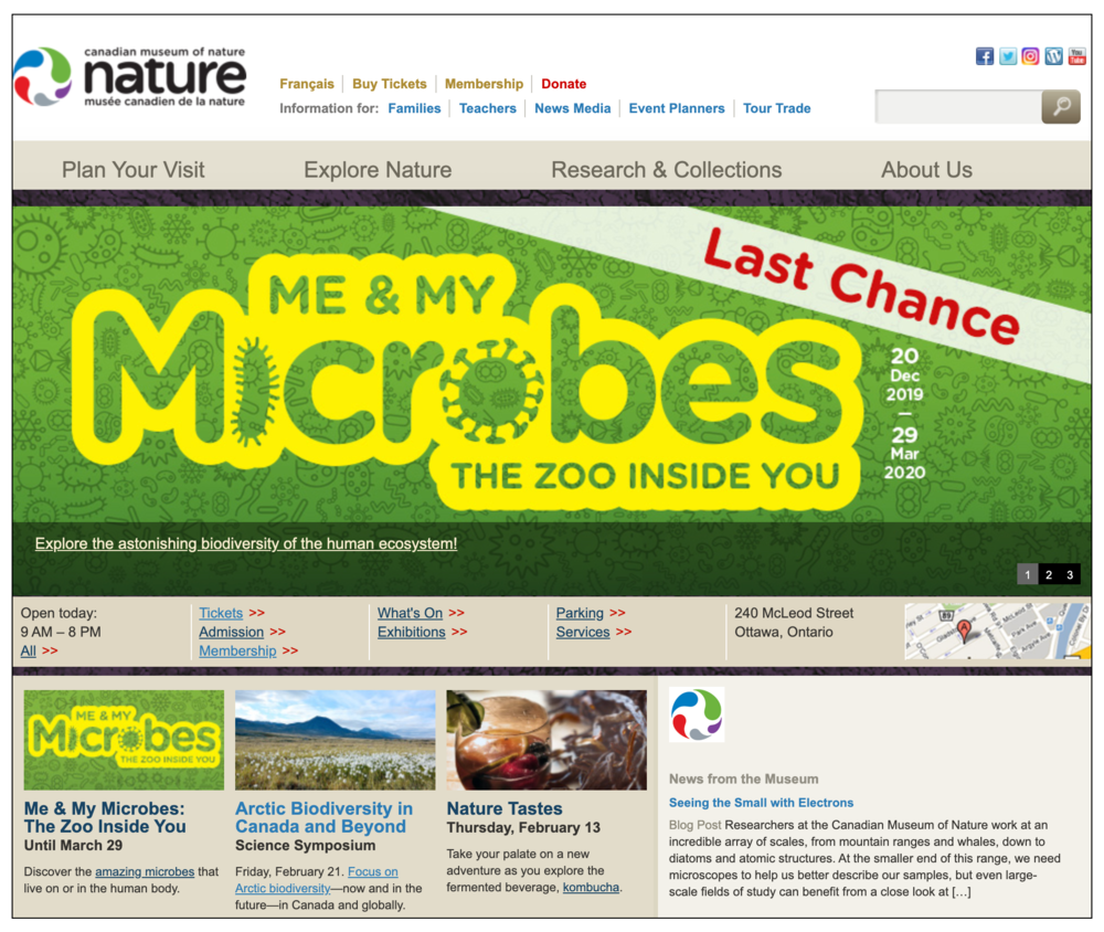
Problem
Home Page has four navigation bars to access the same information
“Buy Tickets” and “Donate” labels are not obvious, while the color red signifies warning or danger
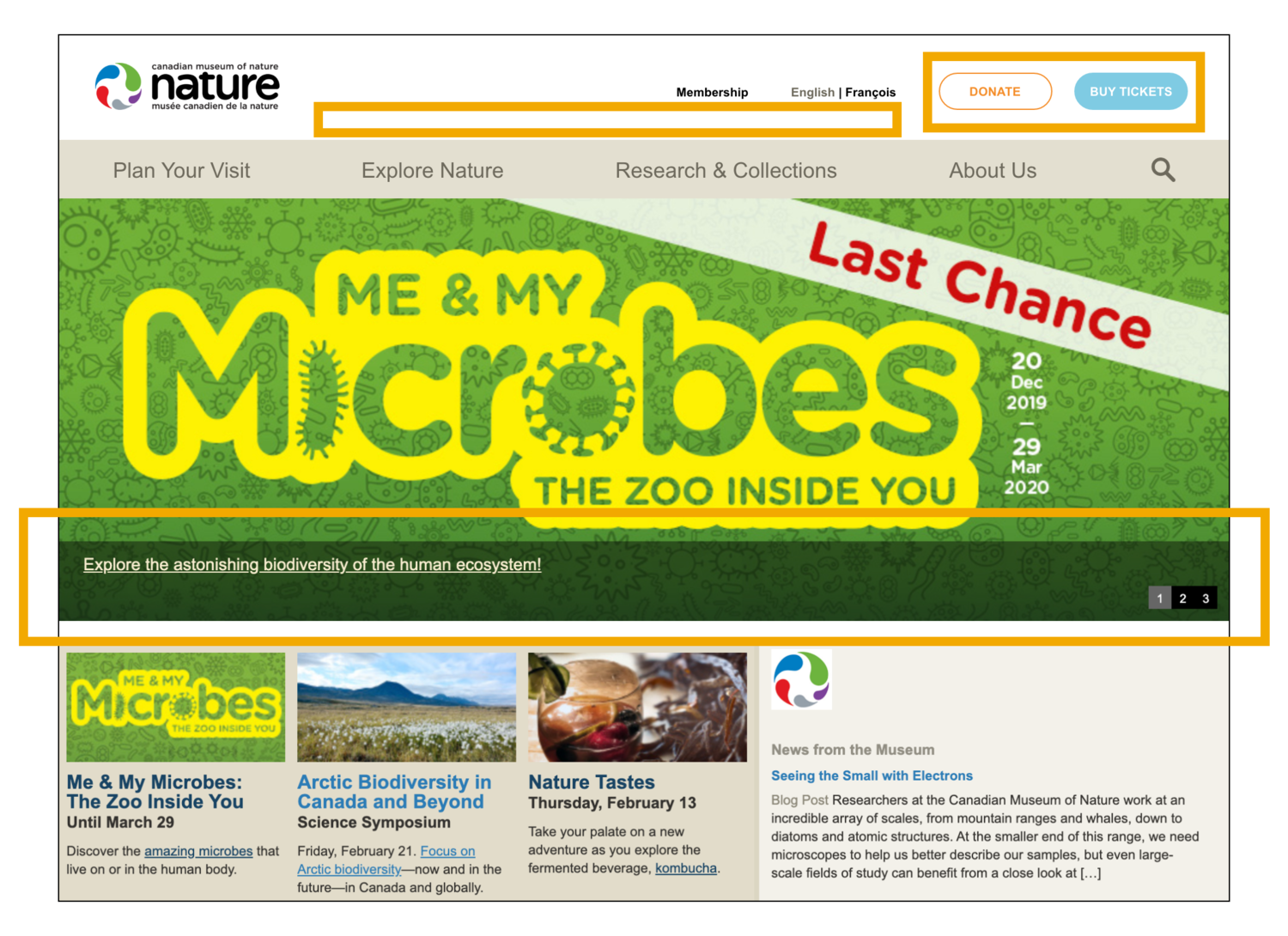
Recommendation
Remove “Information for” navigation bar to prevent detouring users
Remove middle navigation bar, as all the content can be found in the “Plan Your Visit” section
Create “Donate” and “Buy Tickets” call to action buttons on the top sub-navigation bar
Problem #2: Information is not easily discoverable to help users make important decisions quickly.
Recommendation: Improve visual hierarchy and use filters to organize information.
Participants struggled to find key information site-wide but it was particularly evident on the Admission page. This was due to excess text, unclear hierarchy, and excessive scrolling, altogether making participants impatient.
“In the dropdown menu for admission, it would be helpful if I saw all of the different admissions options that I had, and that I could just click.”
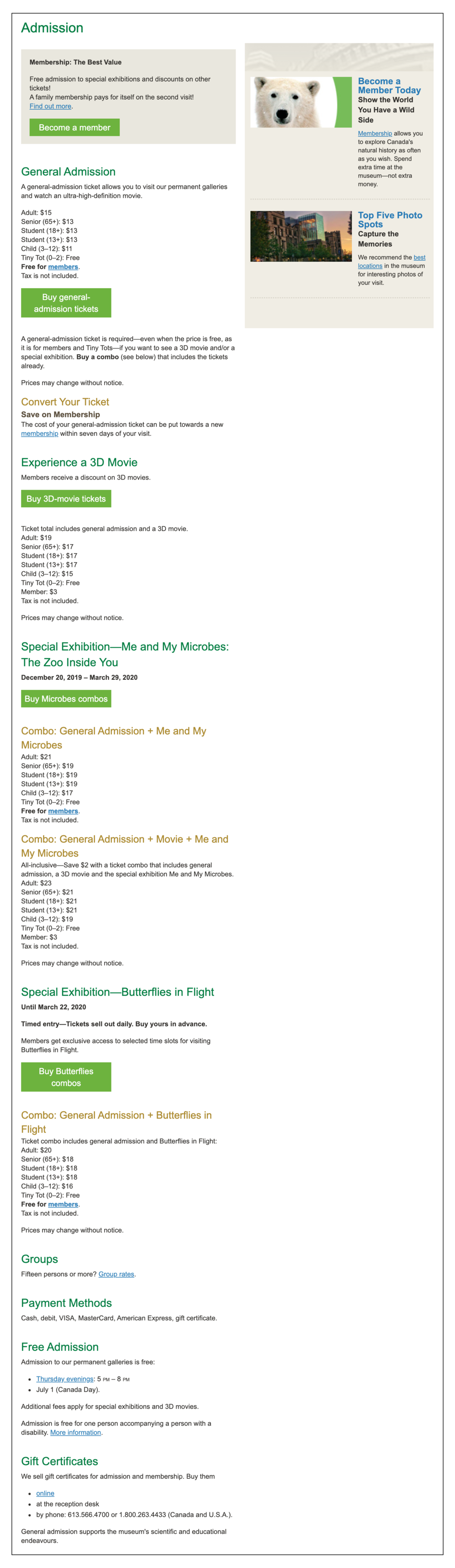
Problem (left)
Ticket prices are displayed in a long, list format. This requires users to have to memorize or scroll up and down to retrieve the prices
There is an unclear hierarchy for membership details, general admission tickets, combo tickets, and secondary information
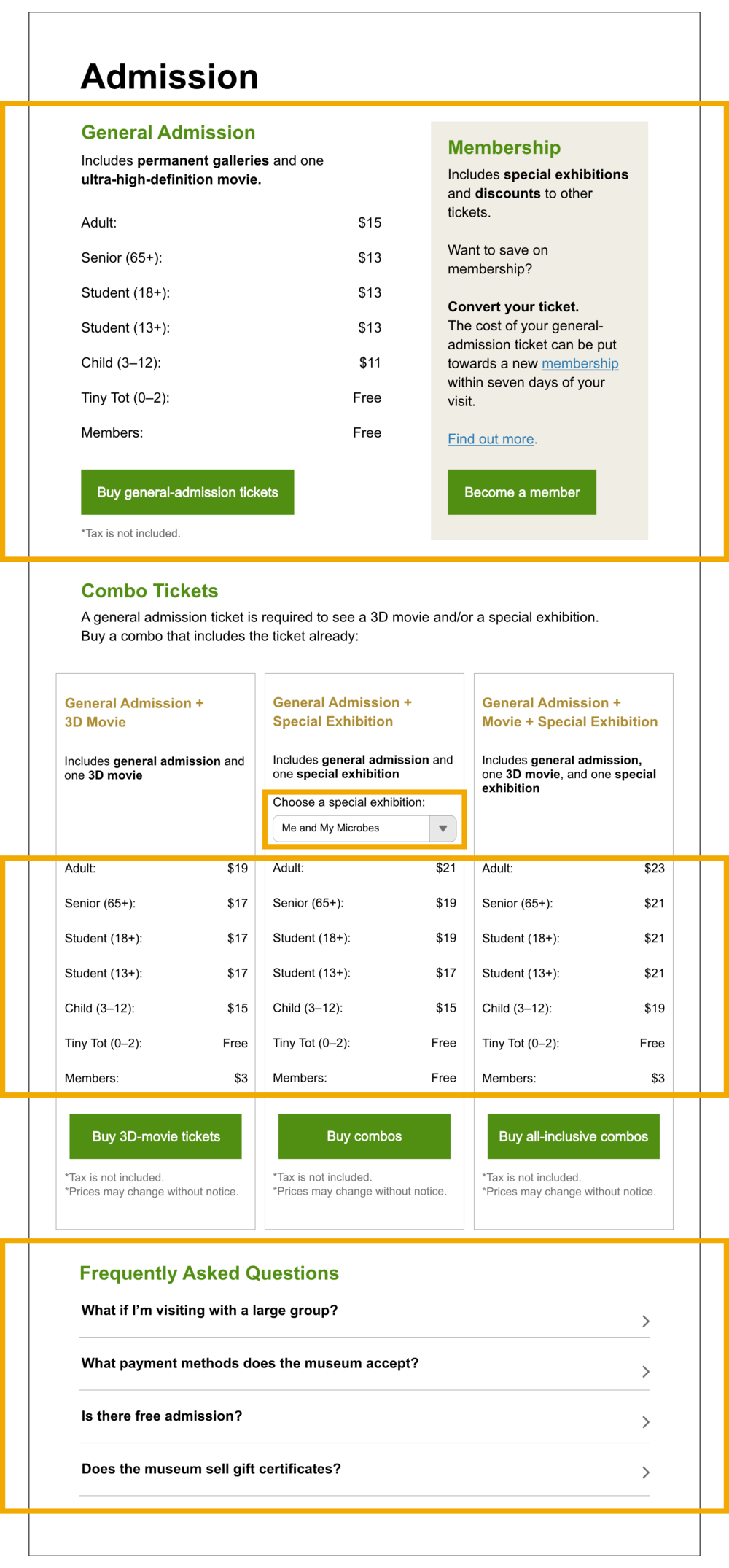
Recommendation (right)
Display general admission ticket prices and membership details at the top to show the most important information first
Organize ticket combos in one row so visitors can compare prices and save time on scrolling
Include a drop-down filter for “special exhibitions” to avoid information overload
Include a FAQ collapsible list to hide secondary information which users can expand on
Problem #3: Layout and text do not support readability for optimal user experience.
Recommendation: Emphasize important event details and information so it is easily discoverable.
While the majority of our participants were able to accomplish the tasks, they also remarked that it would have been much easier to complete if key information was clearly visible. The problems they encountered were due to redundant texts and inefficient use of photo arrangement and layout.
“It’s so hard to read. The words are small and cramped into the center. Everything looks the same so it really forces you to read closer to find the relevant information you need.”
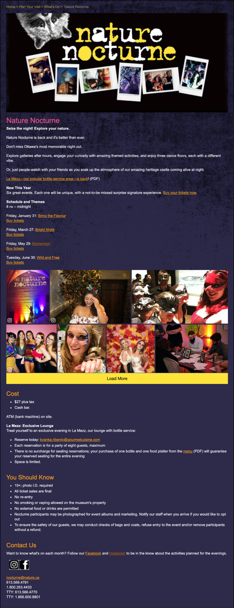
Problem
Long, lengthy texts inhibit users from skimming
Font size and background color does not support readability
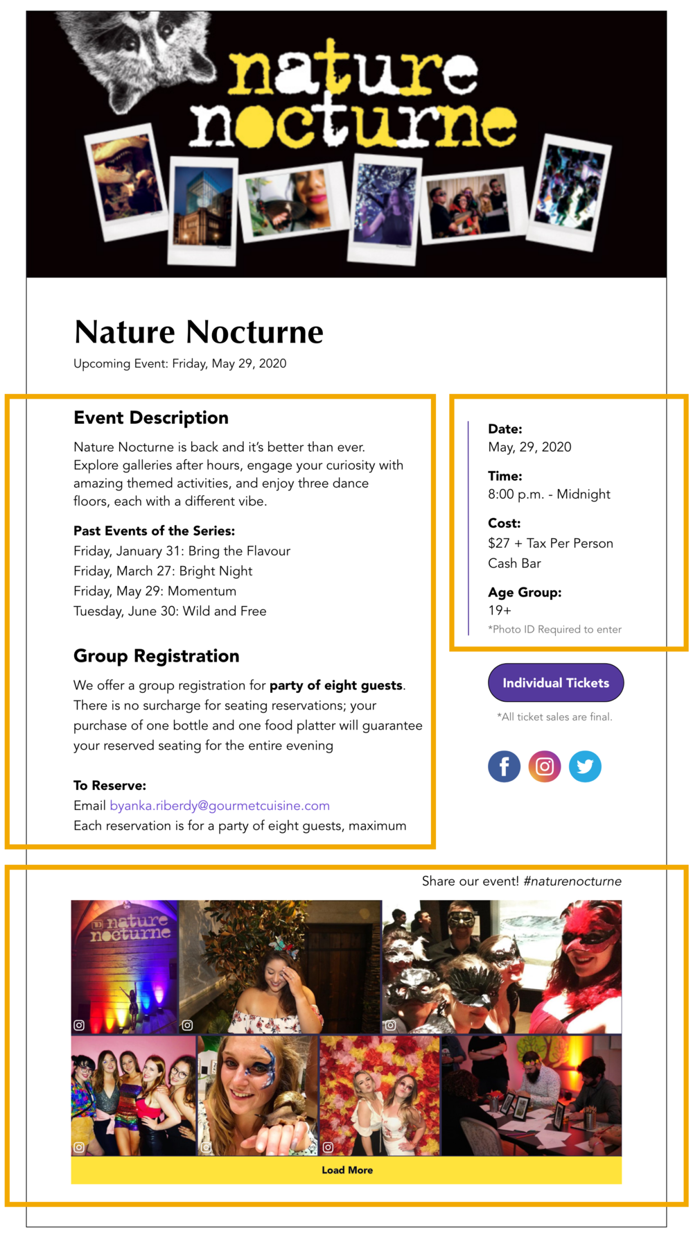
Photo collage overshadows vital information
Website’s layout makes photos and text appear boxy and cramped
Recommendation
Make key information (date, time, cost, age group) discoverable by adding a right-hand column
Shorten texts and include subheadings in larger font sizes
Move the photo collage to the bottom so event logistics can be seen all together
Switch to a light background
Play with different font pairings for a more modern feel
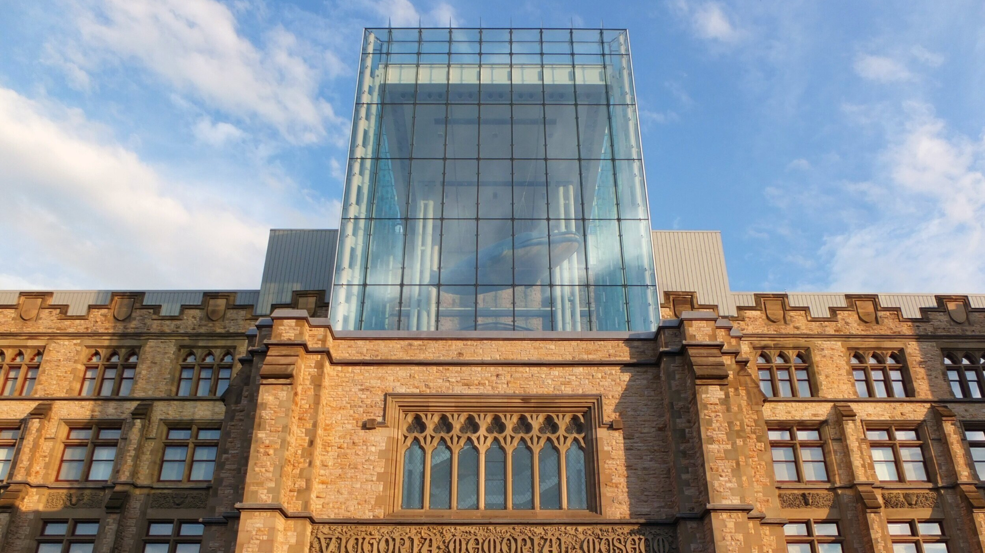
Photo credit: Joe
CLIENT FEEDBACK
Meeting & Future Considerations
On May 6, 2020, we presented our findings to two members of CMN’s web and content development team. They were impressed with our work, and thought our recommendations were all great suggestions to consider.
Our client found our findings on redundant information and confusing entry points in their information architecture particularly helpful. It has been an ongoing challenge for the Museum, and they realized presenting all different pathways for perspective audiences on the Home Page may further confuse other set of audiences. This will be a key challenge for them to tackle and they are happy to share our recorded presentation and full report with their team during their website redesign.
For future analysis, we recommended CMN to conduct card sorting and tree testing to uncover which audiences (parents, educators, tourists, tourist groups, researchers) and key actions (buying tickets, donate, become a member) they should prioritize. A prototype should be developed according to the results from their tests, while also taking our recommendations into consideration. CMN can then conduct another round of user tests to see if the same usability problems arise.
REFLECTION
Our team managed to recruit virtual participants, coordinate and attend all scheduled meetings while in different time zones, deliver a full written report, and present a successful deck to our clients all in midst of a pandemic. I feel very proud of my team for everything we’ve accomplished and the individual contributions put in to make it work.
Conducting moderated remote user tests has taught me it is essential to have a back up plan when things don’t work out, such as dealing with technical issues or participants cancelling. Despite the circumstances, this experience also showed how technology has made it so easy to work with clients and team members from around the world, and conduct user tests online via Zoom and Google Meet. In the future, I look forward to conducting face-to-face user tests to see how the method varies from e-meeting to meeting in person.
“You raised the point of redundancy. That is an attempt to reach everybody in where they might be thinking to look. How do we refine that approach and not be afraid of leaving people behind?”
DELIVERABLES:
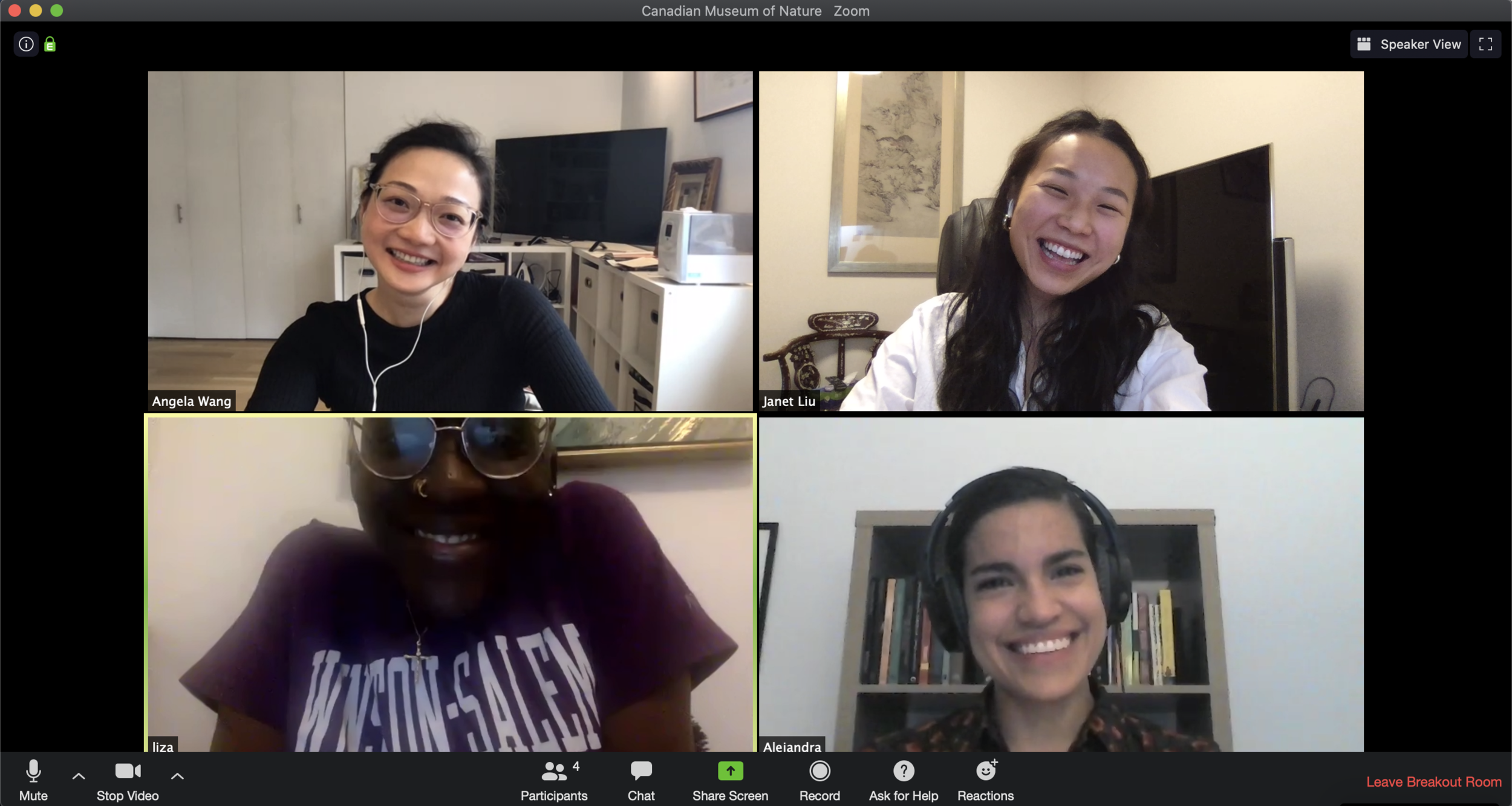
Happy smiles after our client presentation. Zooming from: New York (4:00pm) & Hong Kong (4:00am).