
A Heuristic Evaluation Story
Rijksmuseum
Scroll ↓
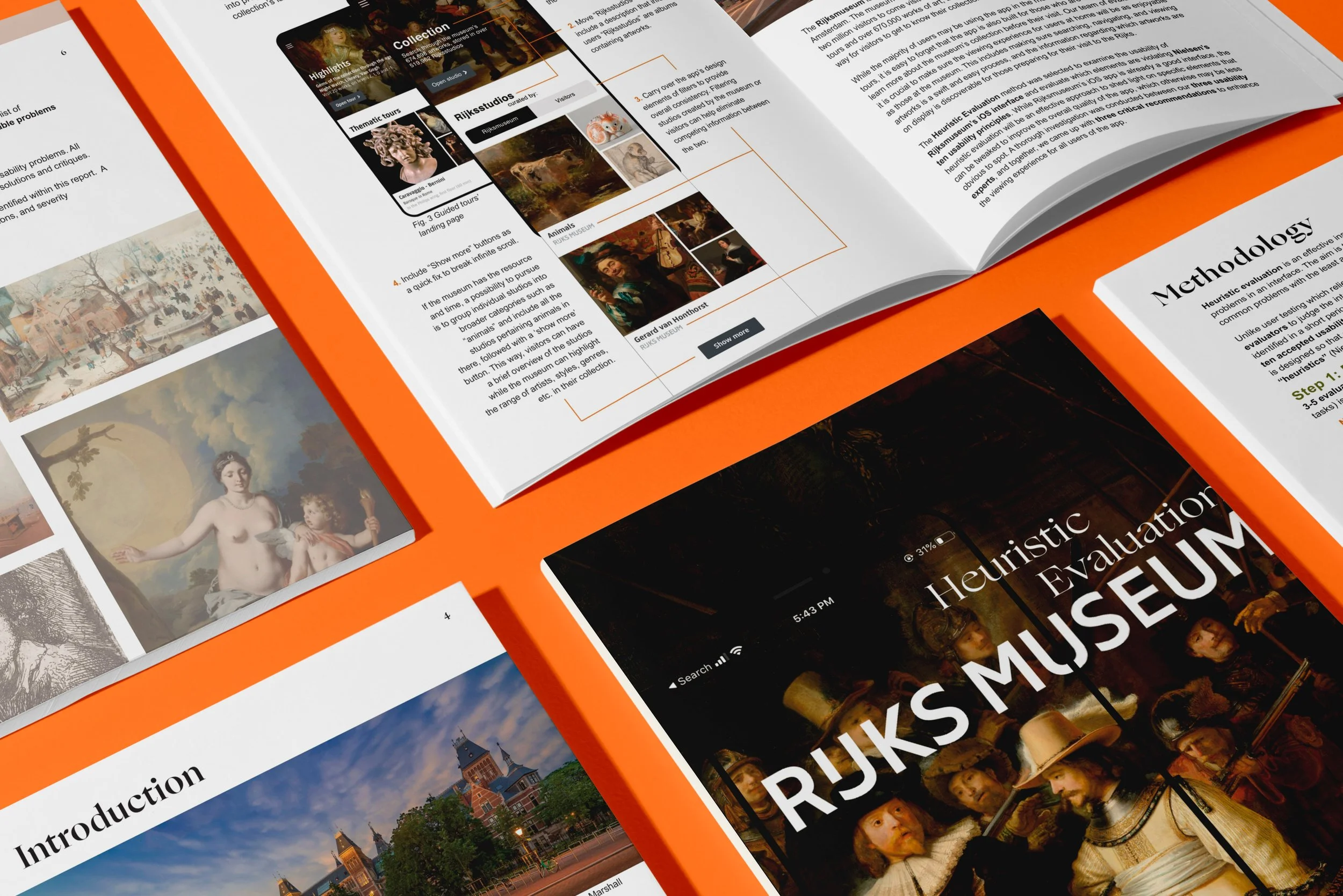
ABOUT OUR PROJECT
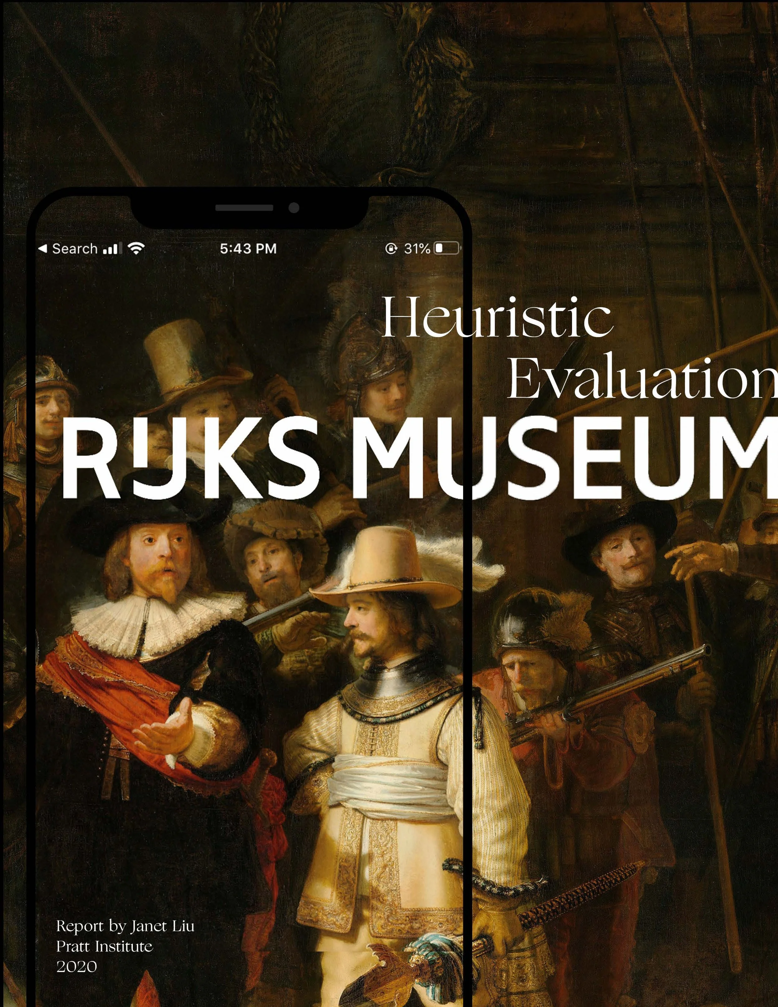
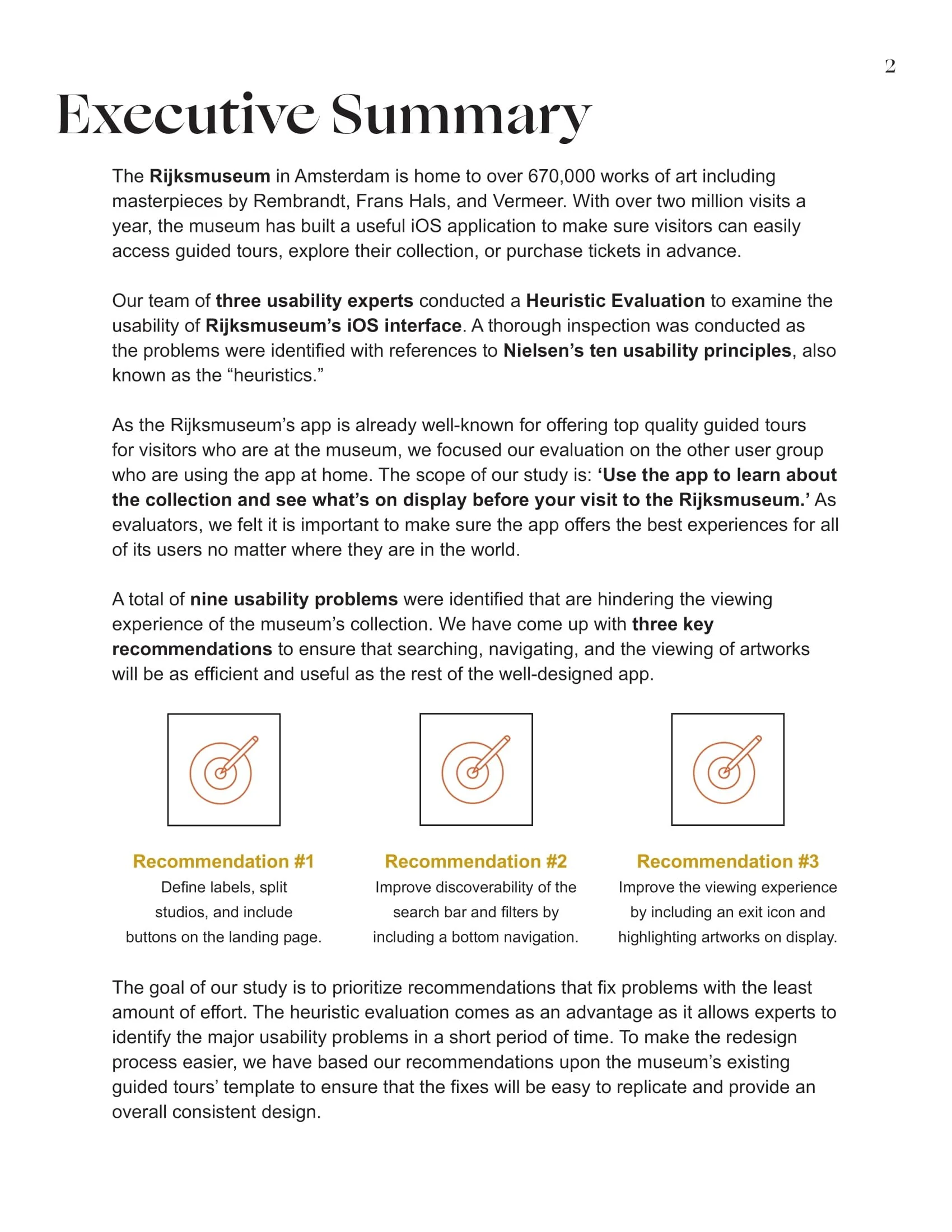
A formal report describing the results of a heuristic evaluation for Rijksmuseum’s website and mobile interface. The research conducted is based on Jakob Nielsen’s Ten Usability Heuristics and was submitted for INFO644: Usability Theory & Practice course at Pratt School of Information.
DATE
February 22, 2020
RESEARCH METHOD
Heuristic Evaluation
DESIGN TOOLS
Adobe InDesign
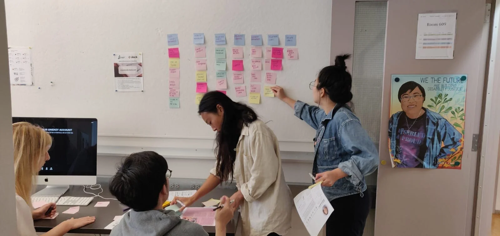
Meet Team Hugo. From left to right: Nora, Kaige, Janet (me), and Ting
MY ROLE
Our team worked collaboratively to submit redesigned web and mobile user flows and a high-fidelity prototype as our final products.
My roles included:
Conducting two semi-structured interviews and two observations
Conducting two card sorting studies and two tree testing studies
Conducting two in-person remote “think aloud” usability evaluations with low-fi prototypes
Analyzing and consolidating usability problems and writing individual research briefs
Creating a paper low-fi prototype (mobile + desktop) for our team
Creating and presenting final presentation deck for high-fi prototype
TEAM MEMBERS
Nora Gordon
Ting Wang
Kaige Zheng
PROJECT PATH
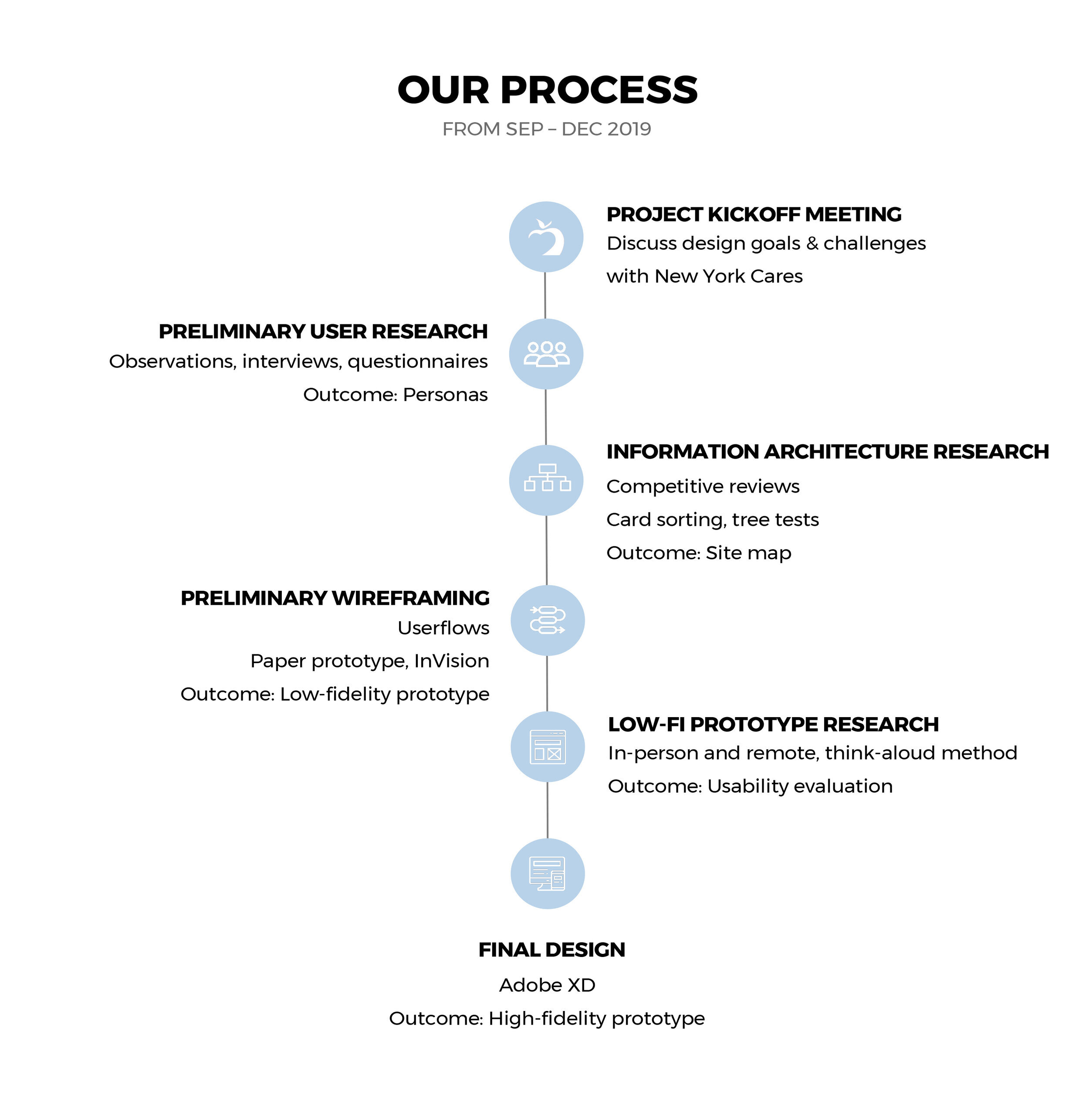

Photo credit: Pexels
01.
Project Kickoff Meeting
SCOPE
New York Cares was an early adopter of technology but their current website does not match the ease of their product. Divided into groups of 3-4, my team framed our challenge as:
“How can we design a website to engage citizens of the “busiest city in the world” to volunteer for a cause they care about?”
Client’s Goals
New York Cares laid out four redesign goals:
An improved information architecture
Design consistency
Improved search functionality
Improved mobile experience
Our Solutions
The solutions we came up with are:
Design a minimalist information architecture that prioritizes increased information clarity
Streamline search process that prioritizes search bar and filters
Employ a clean, consistent, and approachable style identity
Use responsive design for mobile experience
02.
Preliminary User Research
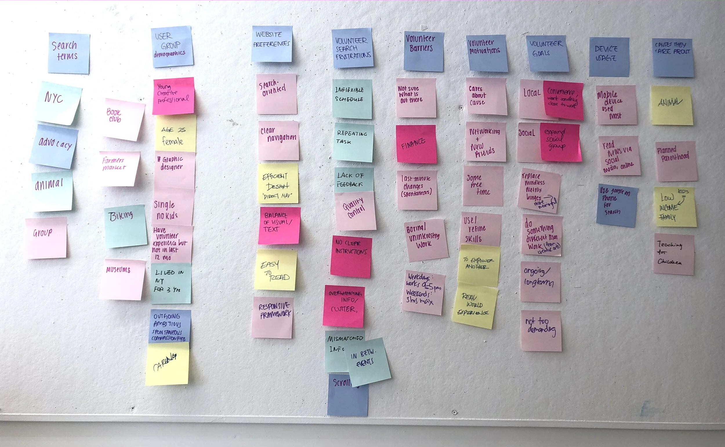
RESEARCH METHODOLOGY
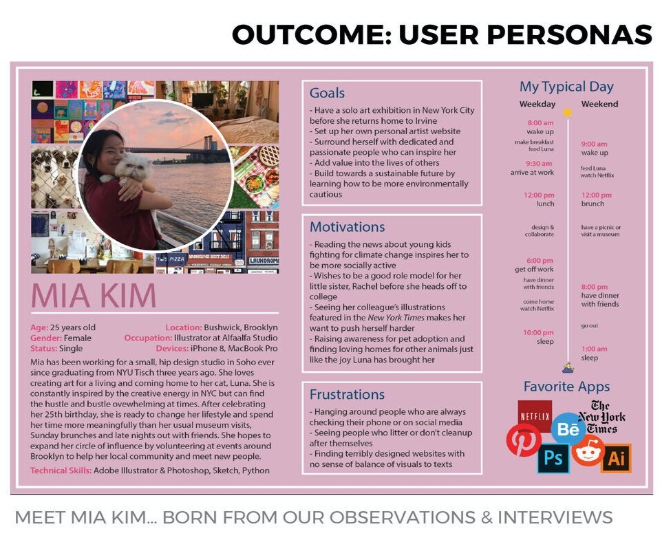
Current and interested volunteers were recruited. Each member of our team was responsible for focusing on a particular user group using two of the following methods to learn about participants’ preferences, values, and behaviors. The outcomes from our research helped guide our user personas.
Observations
“Imaging yourself registering for an event of interest and narrate your thoughts and feelings.”
Interviews
“What do you value when it comes to volunteering? What do you hope to get out of this experience?”
Questionnaires
What is your reason for volunteering? How often do you volunteer?
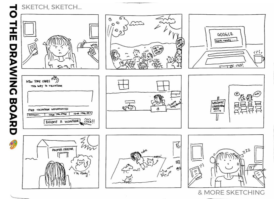
Early storyboard sketch
KEY FINDINGS
From there, we continued working on our personas. Two major takeaways were gathered from our process are:
First-time volunteers want to be confident in what they sign up for
Big moving buttons are favored over the abundance of text
Young, recent New Yorkers are on the lookout for activities to do (both day & night)
03.
Information Architecture Research
UNDERSTANDING THE COMPETITION
The next step was to look at current websites similar to New York Cares. We picked five competitors (direct and indirect) and six dimensions to compare and contrast.
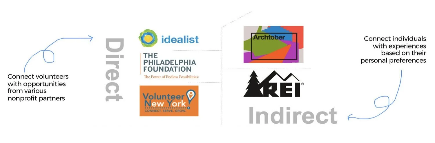
Direct competitors: Idealist, The Philadelphia Foundation, Volunteer New York. Indirect competitors: Archtober, REI
Then created a spreadsheet and conducted the review based on a 3-point rating scale (low/medium/high).
Some of the key design recommendations features we found from the six dimensions include:
Homepage: search-based, minimalist in design
Navigation: global navigation with 2-3 main items and sticky navigations
Search-bar: front and centered, narrow search-bar with zip-code search
Search results page: card and calendar mode with color-coded results and hovering effects
Item page: include a variety of images, weighted fonts, filtered jumps, ‘back to results’ search
Mobile: minimalist design with a prominent search-bar and hamburger navigation
A closer look into our six dimensions
CARD SORTING
After the competitive reviews, a closed card-sorting was conducted with the current navigation. Participants matched 26 cards to various search filters and volunteering causes. Overall, the results went smoothly but we found participants struggled most with broad labels and grouping volunteering causes.
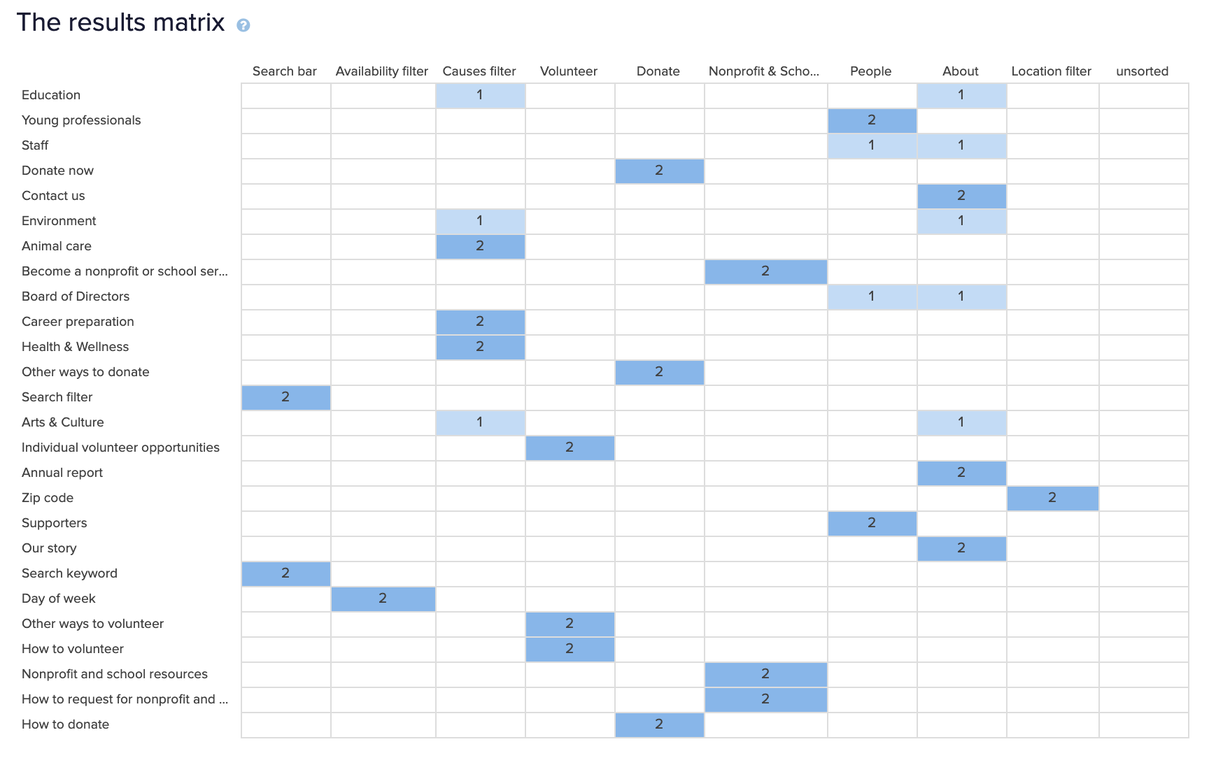
Card sorting study designed on Optimal Workshop
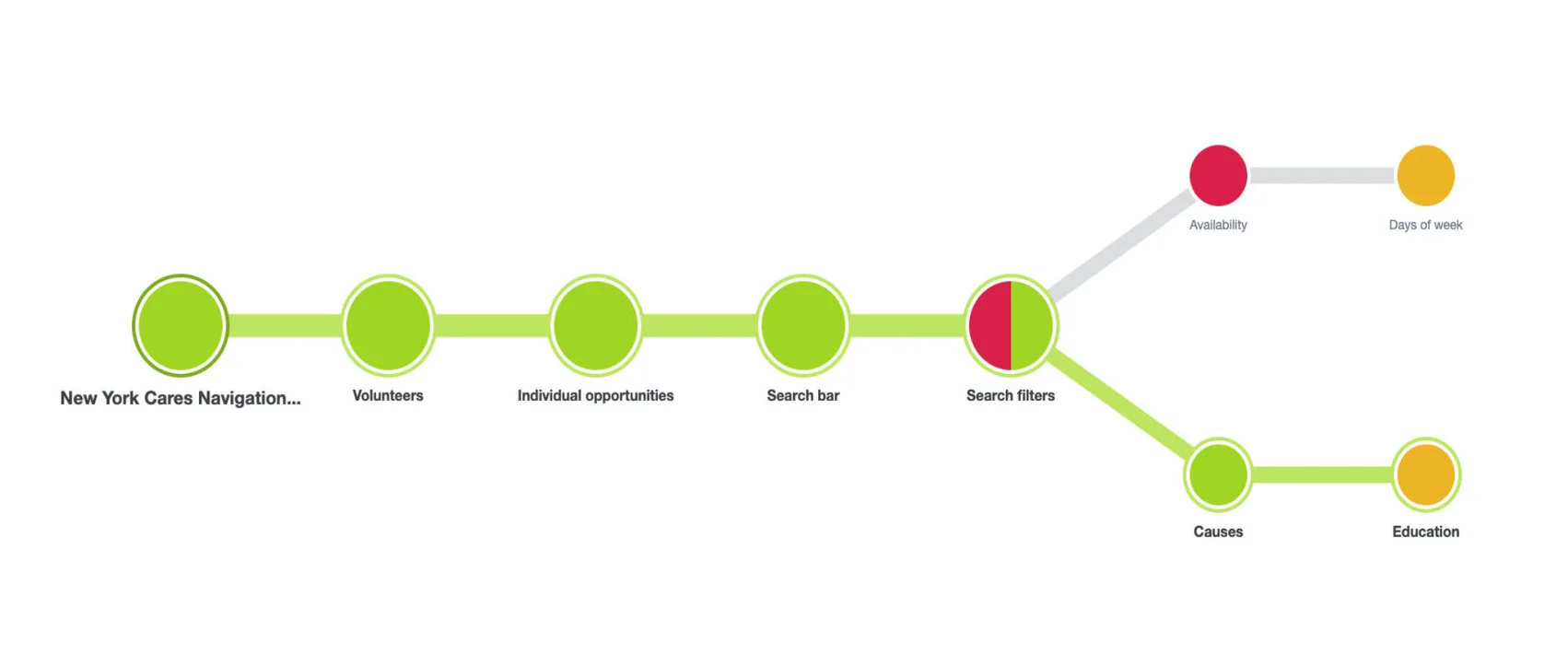
Tree testing study designed on Optimal Workshop
TREE TESTING
We then conducted a tree test using three tasks. The results were rough. Our 8 participants “failed” intended tasks due to labeling and placement confusion. This may be due to an unclear site-wide search, ambiguous labels, and different preferences for search filters. The results helped us narrow down our labels for the revised information architecture.
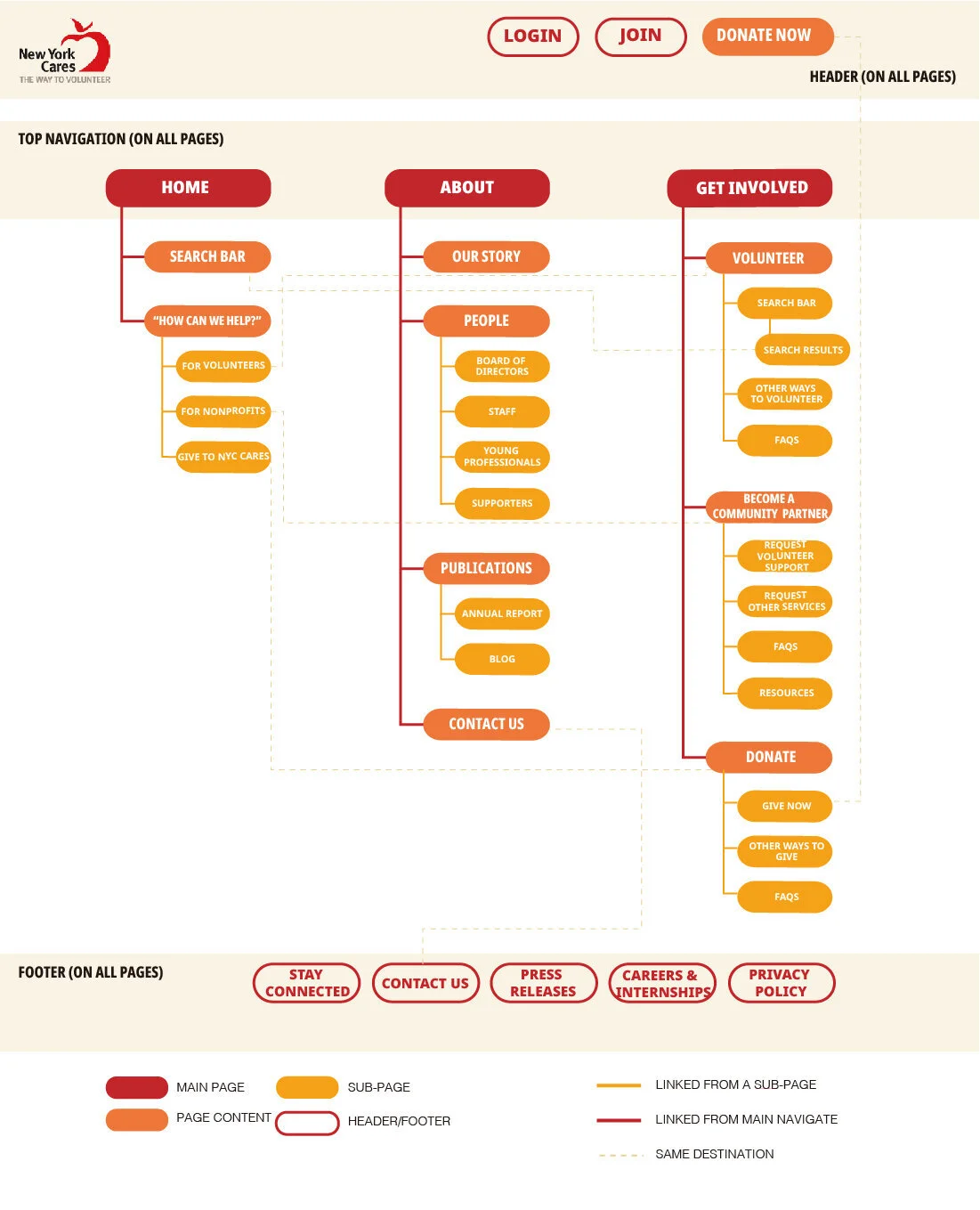
REVISED SITE MAP
A new site map with simplified navigation, organization, and labeling system was created. Our revised site map includes:
Simplifying the main navigation bar from six to three items
Providing multiple routes to certain navigation items such as setting portals on the home page
Maintaining most labels with small adjustments such as “Ways to Volunteer” to “Volunteer”
04.
Preliminary Wireframing
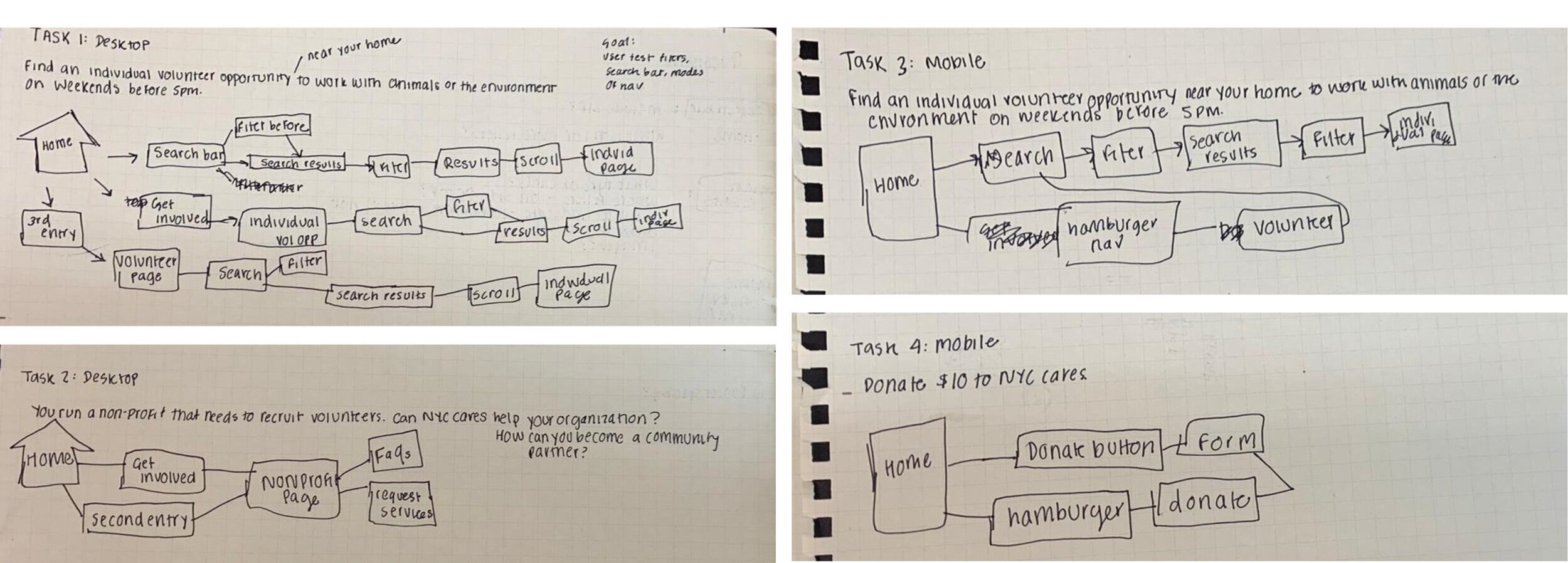
USER FLOWS
After the site-map creation, the next phase was creating our user flows and wire-framing. Our team designed four task flows for New York Cares’ three primary user groups of volunteers, donators, and nonprofits. We matched each user group to the following desktop/mobile tasks based on previous findings that suggest:
Volunteers use both desktop/mobile to seek opportunities
Donators use their mobile to donate
Nonprofits use their desktop to seek volunteers.
DEVELOP TASKS
Here are our two desktop and two mobile tasks:
1.
2.
3.
4.
Target: Volunteers (Desktop)
“Find an individual volunteer opportunity near your home to work with animals or the environment on weekends before 5pm.”
Target: Volunteer (Mobile)
“Find an individual volunteer oppurtunity near your home work with animals or the environment on weekends before 5pm.”
Target: Non-profit (Desktop)
“You run a non-profit that needs to recruit volunteers. Can New York Cares help your organization? How can you become a community partner?”
Target: Donators (Mobile)
“Donate $10 to New York Cares.”
User Flows
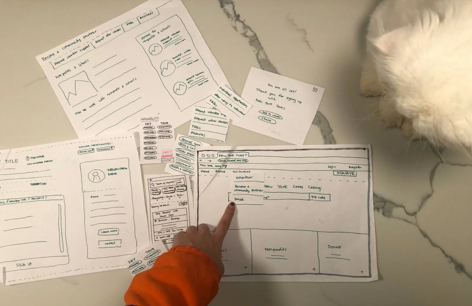
PAPER PROTOTYPE
From there, we each sketched out our own versions for the desktop/mobile user flows and created a new paper prototype uploaded onto InVision.
Hand-drawn paper prototype
05.
Low-fi Prototype Usability Evaluation
PROBLEMS & RECOMMENDATIONS
Our team continued conducting user-research by utilizing in-person and remote “think aloud” usability evaluations with eight participants. Our usability evaluations of the low-fidelity prototype revealed 5 major problems with 5 actionable solutions.
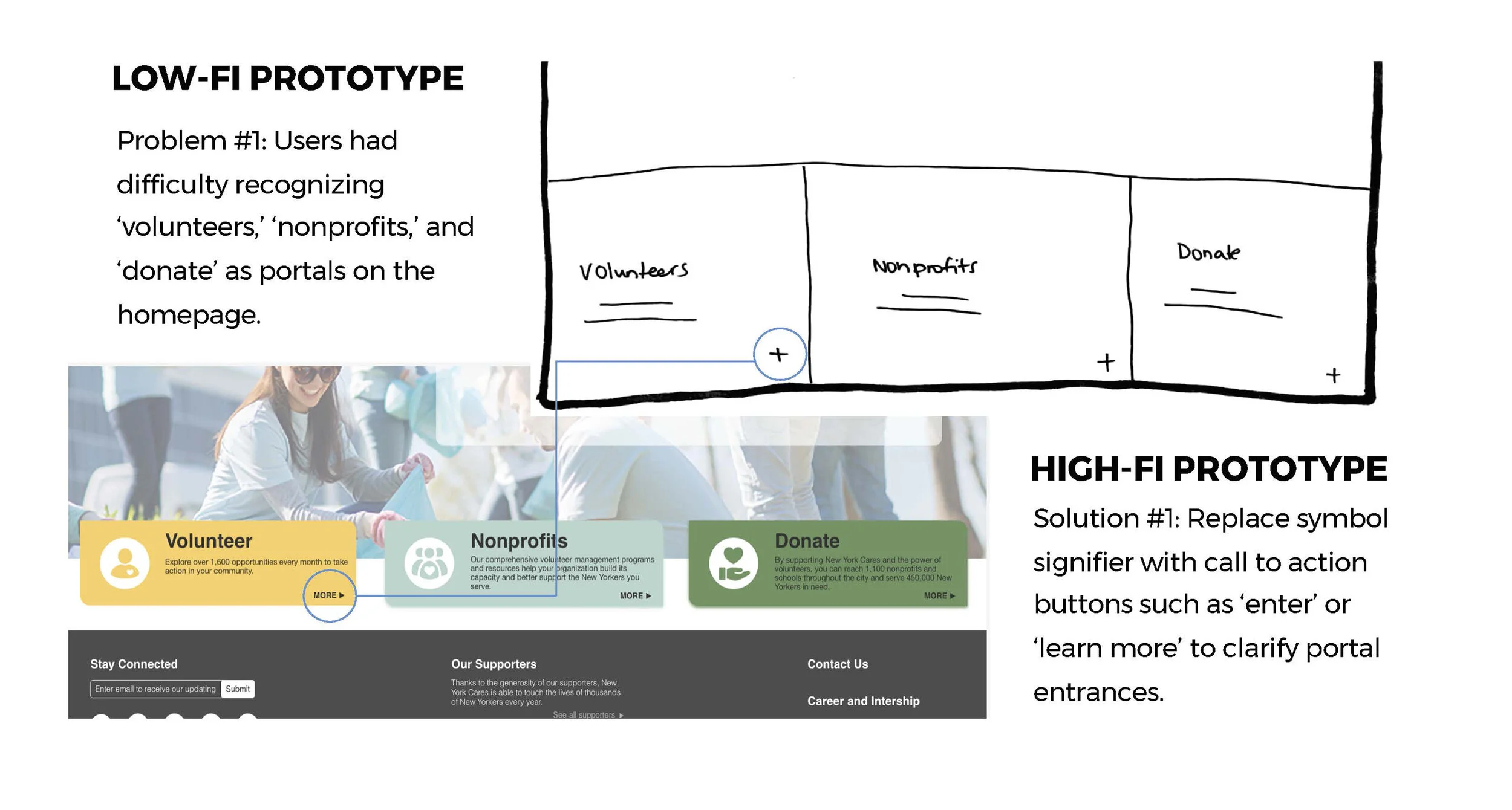
Problem & Recommendation #1: Portals on Homepage
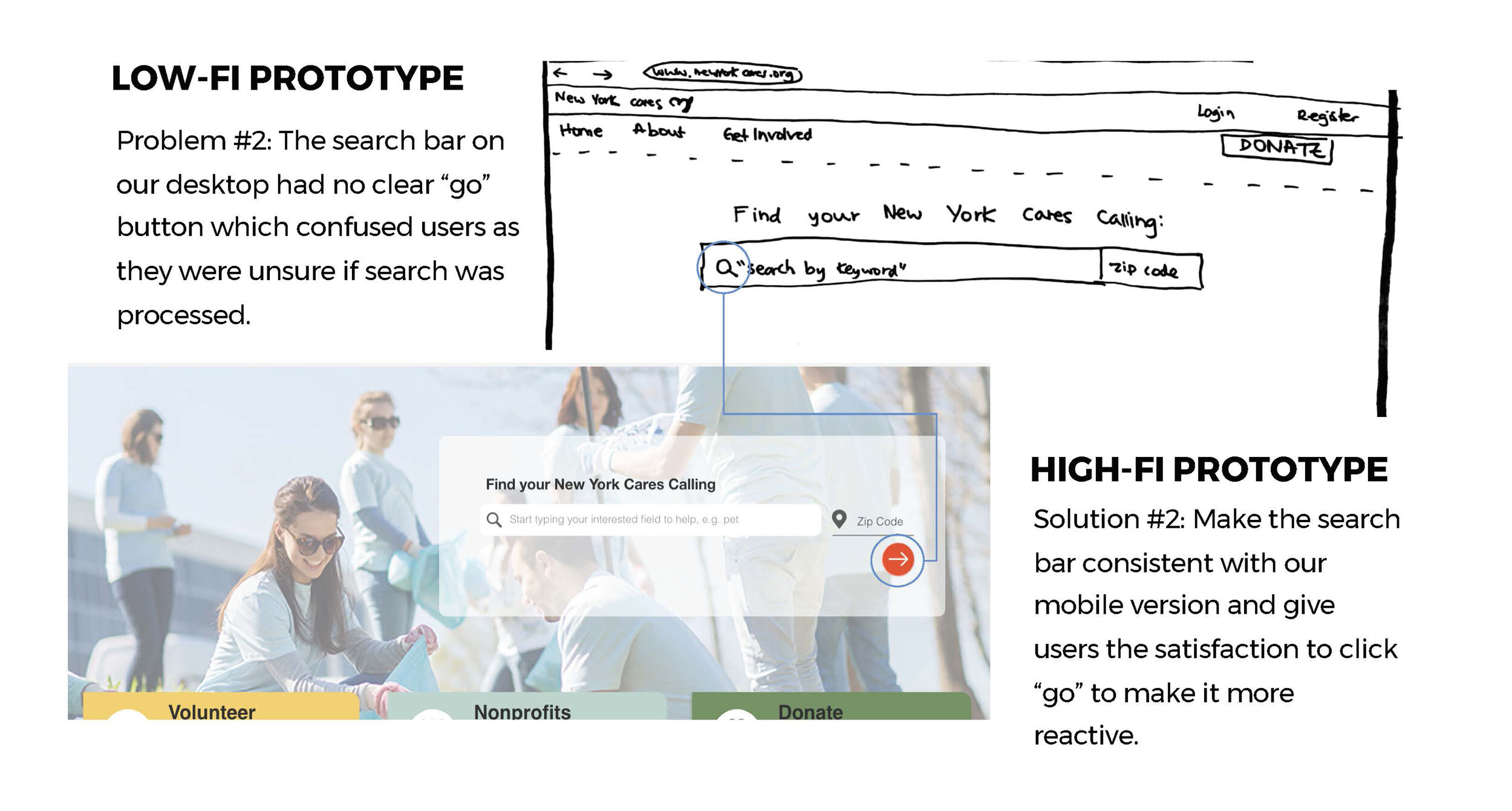
Problem & Recommendation #2: Search-bar on Homepage
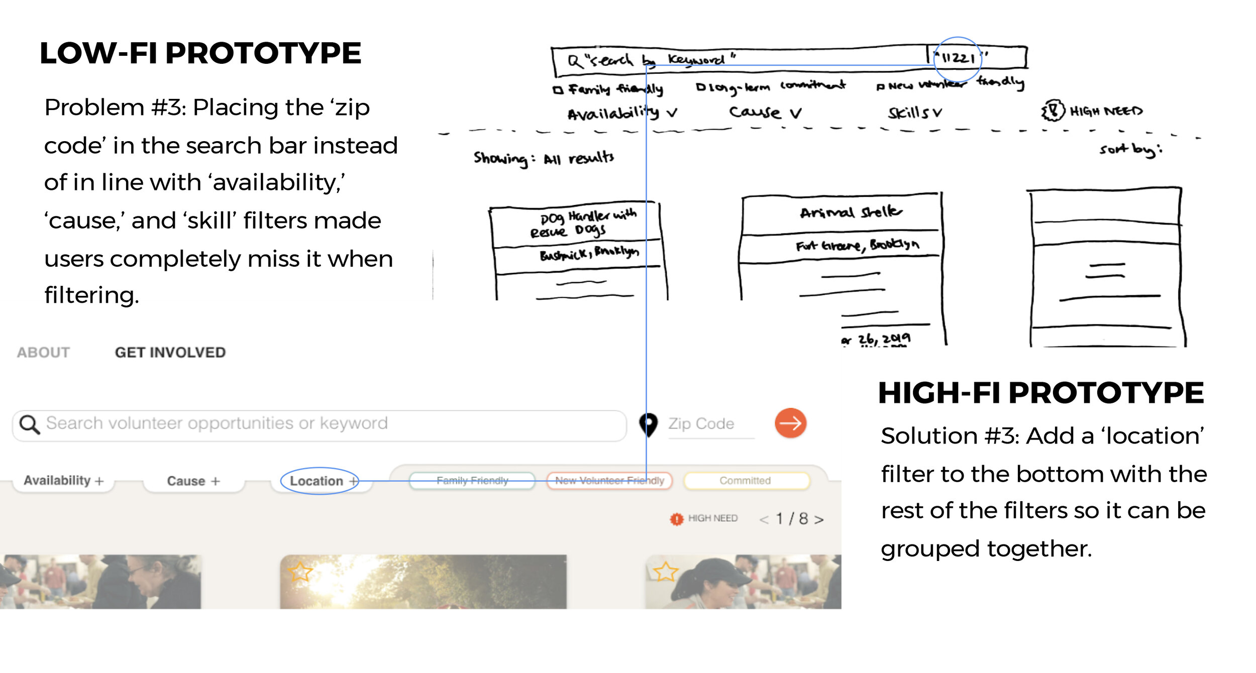
Problem & Recommendation #3: Search filters on Search results page
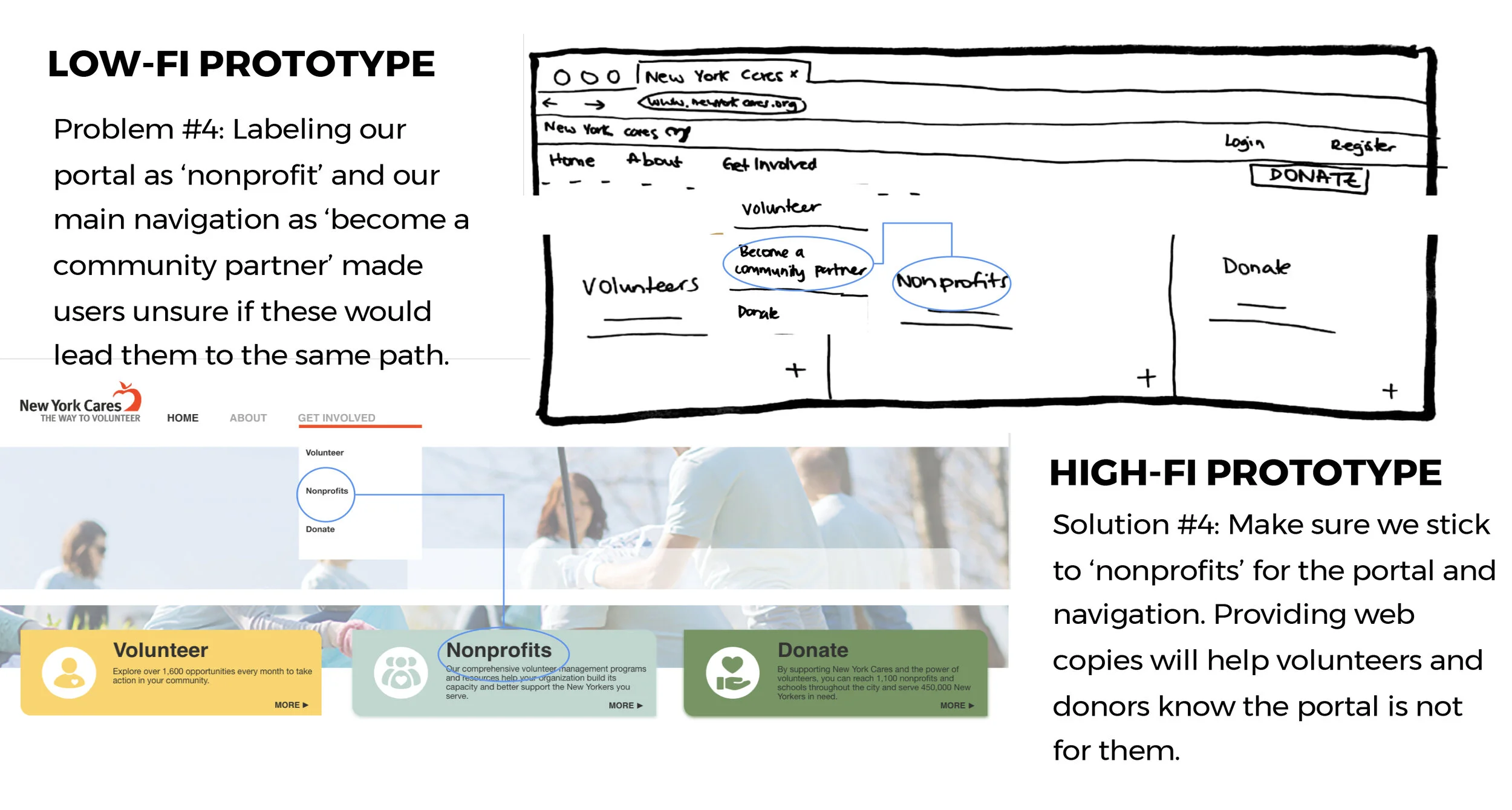
Problem & Recommendation #4: Main navigation bar
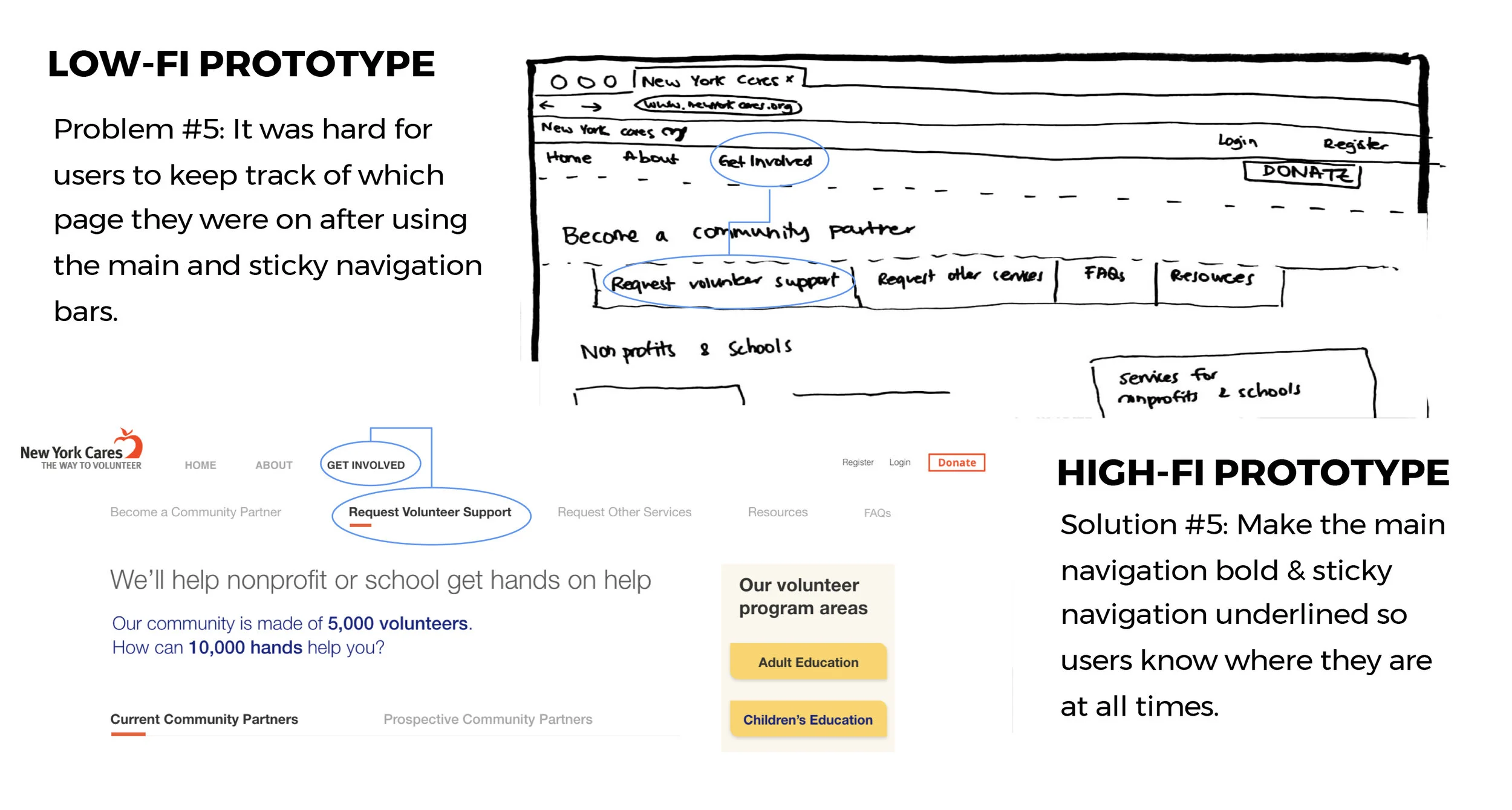
Problem & Recommendation #5: Sticky navigation bar in get involved tab
06.
Final Design
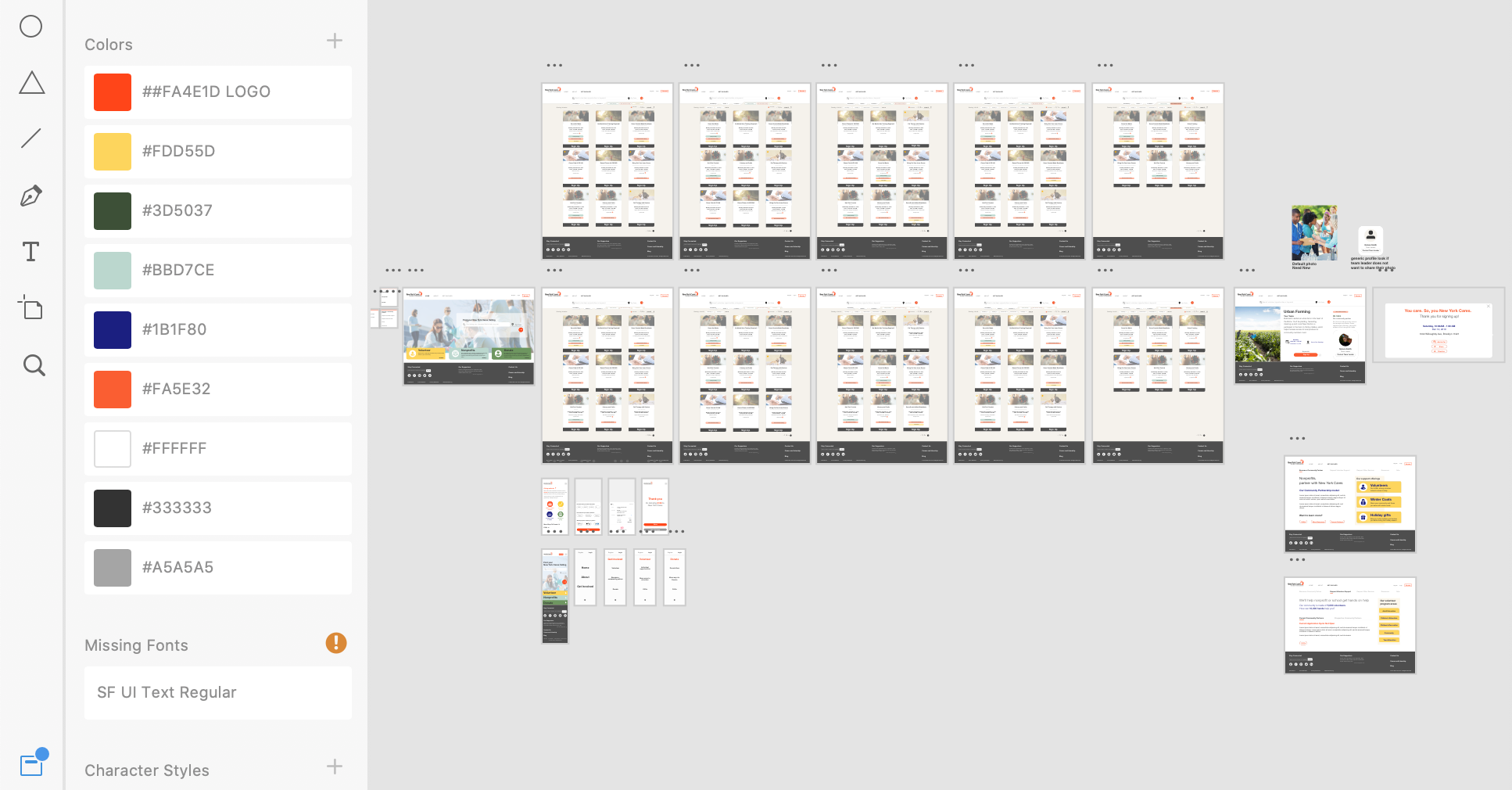
FINAL HIGH-FIDELITY PROTOTYPES
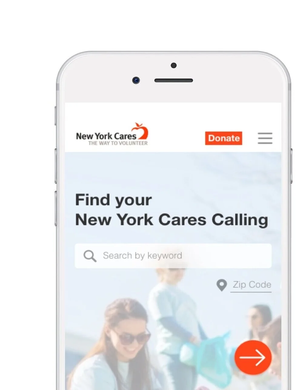
After our usability evaluation, we went back to the (digital) drawing board to deliver a high-fidelity digital prototype (mobile + desktop) that supports the completion of two tasks using Adobe XD.
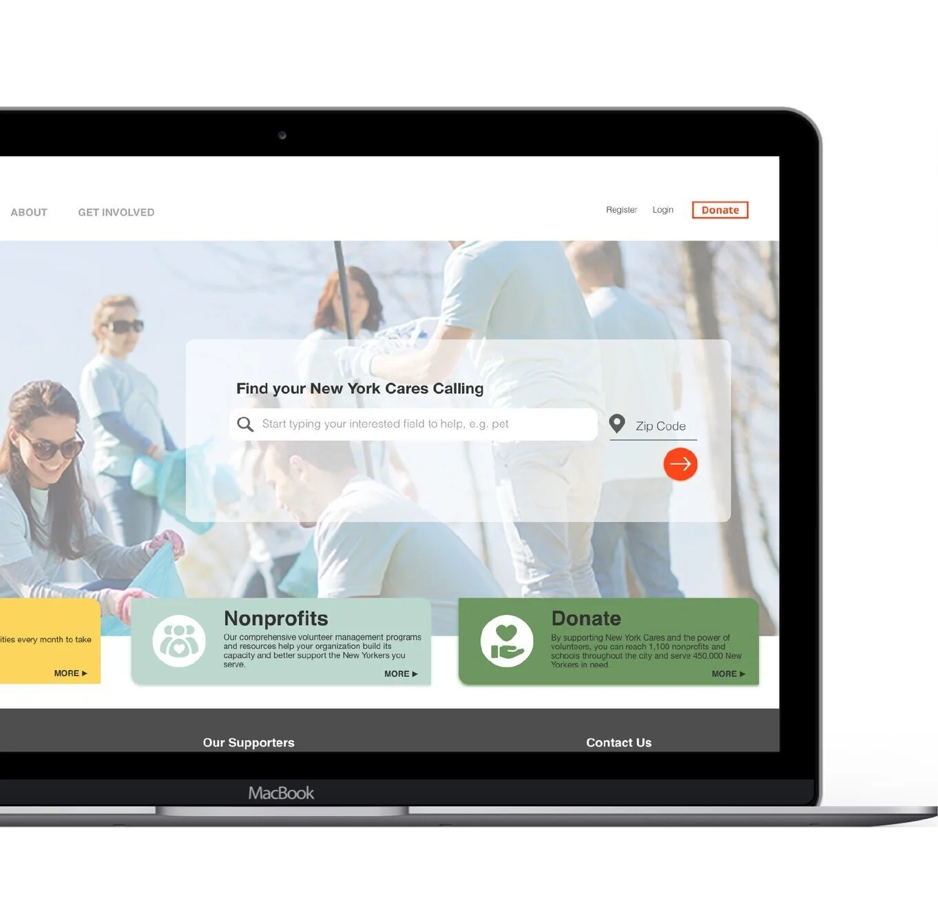
Desktop Final Prototype
User Flow #1: “Find an individual volunteer opportunity in Brooklyn to work with animals or the environment on weekends.
Mobile Final Prototype
User Flow #2: “Donate $100 to New York Cares.”
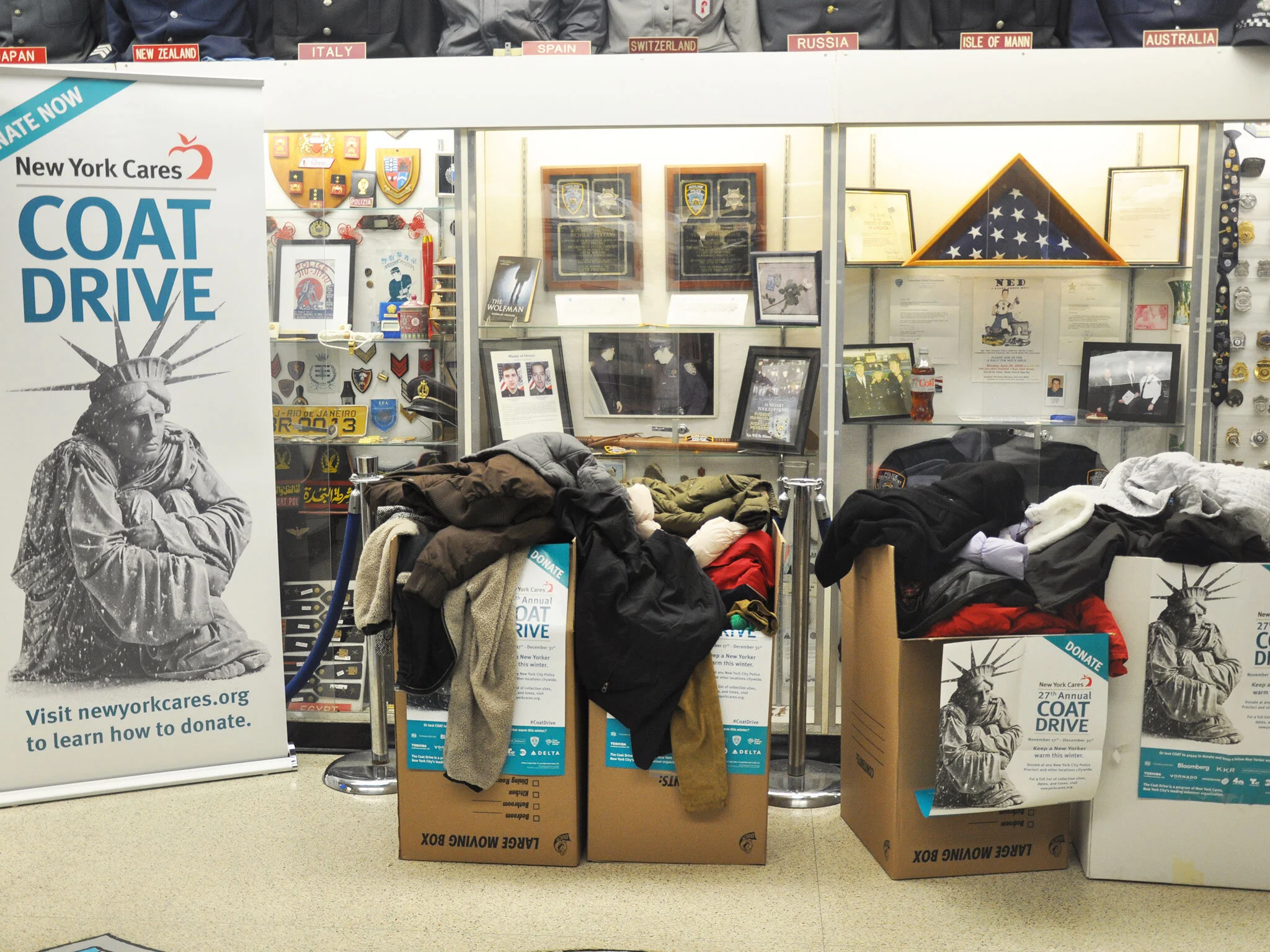
Credit: New York Cares
CLIENT FEEDBACK
REFLECTION
Meeting & Future Considerations
To conclude, we presented our final prototypes to New York Cares and our classmates on December 16, 2019. Each group gave a 10-minute presentation that included desktop and mobile walkthroughs.
Our group received positive feedbacks. New York Cares enjoyed our low-fidelity prototype user evaluations, homepage portals, and how we played with accent colors but still kept to their original identity.
This was my first collaborative design project at Pratt. It was challenging, time-consuming, but highly rewarding to be able to work with real clients and deliver a successful product for a non-profit organization. Some things I will consider next time are:
Getting involved
Sign-up and volunteer through New York Cares’ to better understand its usersPractice!
Be comfortable with InVision and Adobe XD and create even more beautiful prototypesSetting clear deadlines
Recruit more users for card sorting and tree testing to better refine our information architecture